I’ve repainted our bedroom more times than any other room in our house, not because I couldn’t decide what I liked, but because each new color genuinely changed how the room felt to live in, and once I noticed that, I couldn’t stop chasing the next mood shift. The first time this really struck me was switching from a plain builder’s white to a soft sage, the room went from feeling like an unfinished blank space to something that actually felt like ours within a single weekend of painting. That experience taught me that paint color isn’t just decoration in a bedroom, it’s probably the single fastest, most affordable way to genuinely change how a space makes you feel.
Since then, I’ve tested more colors in our own bedroom than I’d like to admit, and helped several friends navigate their own paint decisions too. Below are 24 bedroom paint ideas based on real rooms I’ve lived in or worked on, each one chosen specifically for the distinct mood it creates, not just how it photographs.
1. Soft Sage Green for Calm
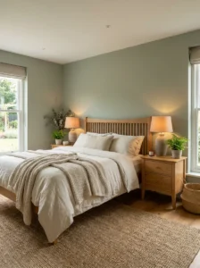
Sage was the color that first taught me how much paint alone can shift a room’s entire feeling, and it remains one of my most frequent recommendations for anyone wanting their bedroom to feel genuinely calming rather than simply neutral. I painted our own bedroom sage a few years back, and the sense of quiet and ease I felt walking into the room afterward was noticeably different from how the space felt under its previous plain white.
The color sits in that comfortable middle ground between grey and green, meaning it never feels too bold or attention-grabbing, while still offering considerably more warmth and character than a standard neutral. I’d recommend a slightly muted, greyed-down sage specifically over anything brighter or more saturated, since the muted version reads as more sophisticated and genuinely calming, closer to the muted tones found throughout nature.
I’d suggest pairing sage with warm wood furniture and cream or off-white bedding, avoiding cooler grey textiles, which can make the combination feel sterile rather than warm. Warm white bulbs bring out sage’s richness considerably better than cool or daylight bulbs, which tend to wash the color out and leave it looking flatter and greyer than intended.
2. Deep Navy for Drama and Retreat
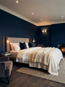
Navy remains my most frequent recommendation for anyone wanting their bedroom to feel like a genuine retreat rather than simply another room in the house, since its depth and richness create an enclosed, cocoon-like quality that few other colors achieve as effectively. A friend was initially nervous about committing to navy in her fairly small bedroom, worried it would feel like a cave, but within a week of testing it on one wall, she’d decided to paint the entire room.
The mood navy creates depends heavily on contrast, since the color needs lighter elements, white trim, light wood flooring, crisp bedding, to keep it from feeling heavy rather than genuinely luxurious. I’d recommend layering multiple light sources specifically for a navy bedroom, since the color absorbs considerably more light than a paler wall would, and a single overhead fixture typically isn’t enough to keep the room from feeling dim during the day.
I’d suggest brass or warm gold accents alongside navy walls, a pairing that consistently reads as elegant and considered, adding a touch of glamour that suits navy’s inherently moody, dramatic character particularly well.
3. Warm Terracotta for Cozy Energy
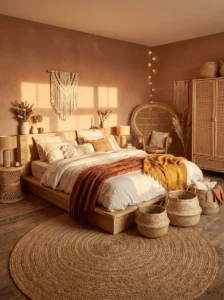
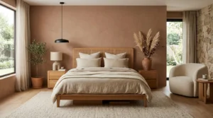
Terracotta brings an earthy, sun-baked warmth that instantly shifts a bedroom’s mood toward something cozy and grounded, closer to a retreat than a purely functional sleeping space. I hesitated before trying this in a guest bedroom, worried it might feel too bold, but it turned out to be one of the most complimented rooms in the entire house once finished.
I’d recommend either a single accent wall or a slightly muted, dusty version of terracotta for full-room coverage, rather than a strong, saturated terracotta across every wall, since the full-strength version can feel heavy in rooms without abundant natural light. Pairing terracotta with woven textures, rattan, jute, linen, echoes its natural, handmade feel considerably better than smooth, cool-toned materials would.
I’d suggest this color specifically for north-facing rooms with less direct sunlight, since terracotta’s inherent warmth genuinely compensates for a lack of golden natural light, something I’ve tested firsthand across a couple of rooms with noticeably different light exposure.
4. Charcoal Grey for Modern Moodiness
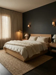
Charcoal creates a quietly confident, sophisticated mood without the full drama of navy or black, making it an excellent choice for anyone wanting a modern, moody bedroom that still feels approachable rather than overwhelming. I painted a home office that doubles as a guest room in charcoal, and the color actually made the room feel more organized and calm, not smaller or heavier as I’d initially worried.
Undertone matters enormously with charcoal specifically, some lean slightly blue, others green or brown, and testing a sample directly on your wall across different times of day helps avoid an unexpectedly muddy result once the full room is painted. I’d recommend this careful testing step before committing to a full charcoal room, given how much undertone can shift the color’s final mood and character.
I’d suggest balancing charcoal with plenty of texture, a chunky knit throw, a woven rug, linen curtains, and lighter furniture in natural wood or white, keeping the room from feeling too heavy despite its deep, saturated wall color.
5. Buttery Yellow for Warmth and Cheer
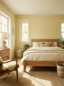
Buttery yellow genuinely changes a room’s emotional temperature, making a space feel warmer and sunnier even on a grey, overcast day. I tried this in my sister’s bedroom after she complained hers felt gloomy despite reasonable natural light, choosing a soft, muted yellow rather than anything bright, and the difference in how the room felt each morning was immediate and noticeable.
I’d recommend a muted, slightly dusty version specifically, since a bolder, more saturated yellow can feel overstimulating in a space meant for rest, working better in a kitchen or playroom than a bedroom. White trim keeps this color looking crisp rather than dated, while natural wood tones and woven textures add warmth that complements its inherently cozy character.
I’d suggest this color specifically for bedrooms with limited natural light, north-facing rooms in particular, since buttery yellow visually compensates for a lack of golden sunlight throughout the day, genuinely brightening the room’s overall mood during darker months.
6. Dusty Lavender for Dreamy Calm
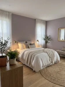
Dusty lavender creates a genuinely dreamlike, soothing mood, more distinctive than a plain neutral but far softer and more sophisticated than a true, saturated purple. I lived with this color in my own bedroom for about two years, and it remains one of my favorite colors I’ve ever painted a room, gentle without feeling babyish or overly sweet.
The undertone needs to lean muted and grey rather than bright or saturated for this sophisticated quality to come through properly, since a true, vivid purple can feel jarring in a bedroom setting. I’d recommend pairing lavender with white bedding, brushed gold accents, and a mix of dried and real greenery, a combination that reads as elegant without being fussy.
I’d suggest paying particular attention to lighting with this specific color, since warm white bulbs bring out lavender’s softness beautifully, while cool or daylight bulbs push it toward looking cold or slightly grey, undermining the whole point of choosing this dreamy, gentle shade in the first place.
7. Warm Greige for Enduring Ease
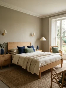
Greige, that warm middle ground between grey and beige, creates a mood of genuine, easy comfort that doesn’t demand much from the room while still feeling considerably more intentional than a purely default neutral choice. When I helped my parents redo their bedroom, we chose warm greige specifically because they wanted something that would feel just as comfortable and appropriate in five years as it did on day one.
I’d recommend testing your specific greige carefully in your room’s actual lighting before committing, since cooler versions can feel flat or slightly cold in rooms without abundant natural light, while warmer greiges bring a subtle coziness that works across a wider range of lighting conditions. The real advantage of this mood is its adaptability, pairing effortlessly with navy, terracotta, sage, or blush accents introduced through bedding or curtains without ever needing a full repaint.
I’d suggest adding warmth through wood furniture, woven textures, and warm brass lighting specifically, ensuring the neutral wall color doesn’t feel boring or generic on its own without this additional layering.
8. Forest Green for Grounded Sanctuary
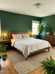
Forest green creates a genuinely grounding, cocoon-like mood, ideal for anyone describing their ideal bedroom as feeling like a retreat or sanctuary rather than simply another functional room in the house. I tested this shade in a friend’s bedroom with large windows facing a garden, and the way the deep green tied the interior to the greenery outside created one of the most satisfying design moments I’ve been part of.
Because forest green is such a rich, saturated color, it works best with decent natural light or well-planned artificial lighting, since too much of a deep green in a genuinely dim space can feel oppressive rather than cozy. I’d recommend pairing this color with warm wood tones, brass hardware, and natural textures like linen and jute, avoiding stark white bedding in favor of something warmer like cream or ivory.
I’d suggest adding real plants specifically to a forest green bedroom, which might sound almost too matched on paper but genuinely deepens the calming, nature-inspired mood rather than looking overdone in practice.
9. Muted Teal for Sophisticated Depth
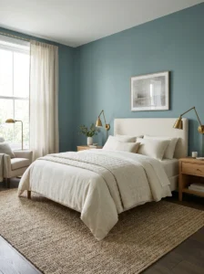
Muted teal walks the line between blue and green, creating a mood with genuine depth and character that a more common neutral simply doesn’t offer. I used a soft, dusty teal in a small bedroom with just one window, worried it might feel too dark, but the color instead gave the space a sense of depth and character the previous plain white completely lacked.
The word “muted” matters enormously here, a bright, saturated teal can feel almost tropical or overly energetic, while a softer, greyed-down version feels calm and sophisticated instead, closer to deep ocean water at dusk than a swimming pool. I’d recommend pairing teal with warm metallics like copper or brass, avoiding cool white bedding in favor of cream or warm ivory tones.
I’d suggest paying attention to how this color shifts throughout the day, since teal looks genuinely stunning under warm lamp light in the evening, taking on an almost jewel-toned richness, while daylight brings out its softer, more subdued character instead.
10. Deep Burgundy for Romantic Richness
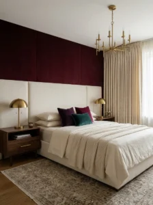
Burgundy creates a mood of rich, romantic luxury when balanced correctly, though it can tip toward feeling dated or heavy if paired with the wrong surrounding elements. I hesitated to recommend this color for years, worried it would read as closer to a Victorian study than a modern bedroom, until I saw it used beautifully in a friend’s apartment paired with modern furniture and warm lighting.
The context matters enormously with burgundy specifically, ornate, traditional furniture can push the mood toward feeling old-fashioned, while clean-lined, modern pieces and minimal decor create an entirely different, more contemporary personality. I’d recommend using burgundy on just one wall, typically behind the headboard, rather than throughout the entire room, letting the color feel intentional rather than overwhelming.
I’d suggest layering multiple warm light sources specifically for this color, since burgundy’s wine-like richness comes alive under soft, warm lighting in a way that cooler or overly bright lighting simply flattens into something closer to a dull brownish-red.
11. Soft Blush for Gentle Sophistication
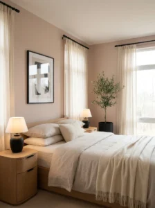
Blush creates a genuinely versatile, softening mood that works in almost any bedroom regardless of who’s sleeping in it, provided you choose a warm-undertoned version rather than anything cold or candy-like. I used a muted blush in a small guest bedroom with very little natural light, and it completely changed the feel of the space, making it warmer and more inviting than the beige it replaced.
The color softens a room without making it feel dull, offering just enough warmth and personality to feel intentional while remaining calming enough for a space meant for rest. I’d recommend pairing blush with matte black accents specifically, a combination that keeps the mood from feeling overly sweet or one-dimensionally “pretty.”
I’d suggest starting with just the wall behind the bed if you’re nervous about committing to a full room, giving you the visual impact of this softening mood without overwhelming the space, and making the color easy to change later if your taste shifts.
12. Warm Off-White for Bright, Easy Calm
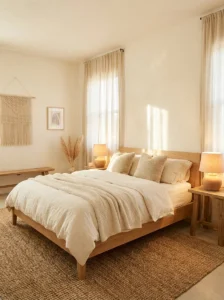
A genuinely warm off-white, rather than a stark, cool white, creates a bright, easy mood that feels considerably more finished and inviting than the flatter, colder whites many builders default to. I repainted our hallway adjacent to our bedroom in a warm off-white after years of living with a stark, cool white, and the shift in how welcoming the space felt was more noticeable than I expected.
The distinction between a warm off-white and a plain, cooler white matters enormously for the mood this color creates, cooler versions often feel sterile and unfinished, while a warm off-white, with just a hint of cream or beige, feels intentional and cozy rather than blank. I’d recommend this color specifically as an excellent base for layering in mood through textiles and artwork, ideal for anyone who likes to change their decor seasonally.
I’d suggest pairing this shade with warm wood tones and warm-toned lighting specifically, avoiding the flat, clinical look that cooler whites can sometimes create even in their warmer iterations.
13. Deep Plum for Moody Romance
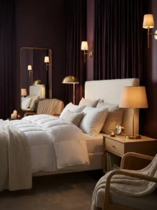
Plum offers a middle ground mood between the softness of lavender and the drama of full burgundy, rich and moody without feeling overly heavy in the way a full room of burgundy sometimes can. I used a deep plum in a bedroom for a client wanting something dramatic but still fundamentally calming, since the room was meant purely for rest and relaxation.
Balance matters considerably here, since pairing plum entirely with dark furniture and dark textiles can make a room feel closed in rather than cozy. I’d recommend keeping bedding light, cream or soft white, and using lighter wood tones for furniture, letting the plum walls stand out as a rich backdrop rather than contributing to an overall dark, heavy mood.
I’d suggest brass or warm copper accents alongside plum specifically, lifting the color and adding a touch of glamour that suits its inherently luxurious, romantic character particularly well.
14. Cool Ice Blue for Refreshing Escape
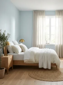
Ice blue creates one of the most refreshing moods available for a bedroom, particularly appealing if you live somewhere warm or simply want your space to feel like an airy escape. I painted a bedroom this shade for a client specifically wanting her room to feel like a break from the heat outside, and the room genuinely felt several degrees cooler from the color alone, even though the actual temperature hadn’t changed.
The challenge with this mood is avoiding something that feels sterile rather than calm and refreshing, which comes down largely to what you pair the color with. I’d recommend warming things up with wood furniture, cream or ivory textiles, and warm metallic accents like brass or copper, avoiding cool white bedding and metal furniture that can push the mood toward clinical rather than refreshing.
I’d suggest this color specifically for rooms with abundant natural light, since ice blue looks crisp and beautiful throughout the day in bright conditions, while it can start to feel flat or grey in darker rooms without much sunlight.
15. Warm Taupe for Timeless Sophistication
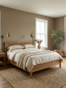
Taupe creates a subtle, sophisticated mood that avoids feeling boring the way a plain beige or grey sometimes can, offering genuine depth without any strong, specific color statement. I used taupe in a bedroom where the goal was a calm, grown-up space without drawing attention toward a single dominant color, and it delivered exactly that while still feeling far from boring.
A good taupe has genuine depth and subtle richness that shifts gently depending on the light, sometimes reading slightly pink, sometimes slightly brown, without ever feeling inconsistent or muddy. I’d recommend this color specifically for anyone wanting a bedroom that feels timeless and won’t need updating every few years, since taupe pairs effortlessly with deep green, soft blush, or navy accents without requiring a full repaint down the line.
I’d suggest prioritizing a warm-leaning taupe specifically over a flatter, more indecisive version, since cheaper or poorly chosen taupes can look muddy rather than genuinely rich and sophisticated.
16. Dramatic Matte Black for Bold Confidence
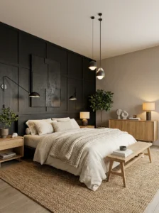
Matte black is not a color I recommend lightly, but it creates a genuinely spectacular, confident mood when used specifically as a single accent wall rather than throughout an entire room. I helped a friend paint an accent wall behind his bed in matte black, and the transformation from a plain, forgettable room into something that felt genuinely designed was dramatic in every sense.
The biggest misconception about this mood is that black walls make a room feel smaller, when in practice, a single accent wall actually creates a sense of depth, almost like the wall recedes rather than closes in, particularly when the remaining walls stay in a lighter neutral. I’d recommend multiple layered light sources specifically for this color, since a single overhead light isn’t enough to keep the mood feeling dramatic rather than simply gloomy.
I’d suggest adding texture through bedding, rugs, and artwork specifically, since a matte black wall alone can look stark without enough surrounding visual interest to support its bold, confident mood.
17. Coral and Peach for Warm Optimism
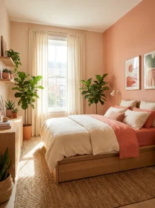
Coral and peach create an optimistic, welcoming mood that’s warm without being overwhelming, somewhere between the softness of blush and the boldness of full orange. I used a muted peach for a young professional’s bedroom wanting her space to feel cheerful without leaning into anything too pastel or childish, and it struck exactly that balance.
The muted, slightly dusty version genuinely matters here, a true coral can feel closer to a beach house accent than something you’d want to fall asleep surrounded by every night, while a softened peach retains the warmth without the intensity. I’d recommend pairing this mood with warm wood, cream textiles, and greenery, avoiding very cool greys that can make both colors look off rather than complementary.
I’d suggest a touch of deep green or navy as a contrasting accent specifically, keeping this warm, optimistic palette from feeling too soft or one-note throughout the entire room.
18. Olive Green for Earthy Timelessness
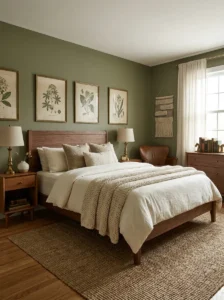
Olive creates a grounded, distinctly stylish mood with an earthy, understated richness that ages particularly well compared to some trendier color choices. I used this in my own home office, which doubles as an occasional guest room, and its timeless, almost vintage quality pairs beautifully with both modern and more traditional furniture styles.
Unlike some trendier colors that can feel dated within a few years, olive reads as intentional and considered rather than trend-driven, a mood that genuinely holds up over time. I’d recommend pairing olive with warm wood tones, cream or ivory textiles, and brass or gold hardware, avoiding cool greys or stark whites that can make the olive look slightly murky rather than rich.
I’d suggest this color specifically for anyone wanting a bedroom that feels grounded and a little unexpected compared to the more common sage-and-neutral palettes that have become so widespread in recent years.
19. Soft Sky Blue for Gentle Rest
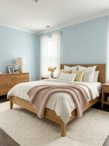
Soft sky blue creates one of the gentlest, most universally calming moods available for a bedroom, often the first color I recommend to anyone unsure what they want but knowing they want something soothing. I used this shade in a child’s bedroom that later transitioned seamlessly into a teenage room, a testament to how versatile and long-lasting this particular mood can genuinely be.
Keeping sky blue from feeling cold or babyish comes down to selecting a shade with a soft, slightly muted quality rather than anything too bright or saturated, since a dustier version feels calm and mature while a brighter one can feel closer to a nursery. I’d recommend pairing this mood with white trim, natural wood furniture, and soft grey or cream textiles.
I’d suggest introducing a warmer accent color, a soft yellow or blush, through pillows or artwork specifically, keeping the room from feeling one-dimensional despite its inherently calm, gentle base mood.
20. Deep Emerald Green for Jewel-Toned Luxury
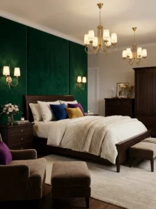
Emerald creates a genuinely glamorous, jewel-toned mood that feels distinctly more luxurious than the softer sage or olive tones discussed elsewhere on this list. I used emerald on an accent wall in a bedroom with brass fixtures and dark wood furniture, and the combination felt luxurious in a way that surprised even the client, who’d initially been nervous about going this bold.
Because emerald is such a saturated, dramatic color, I’d generally recommend an accent wall rather than covering an entire room, particularly in smaller bedrooms where full coverage might feel overwhelming rather than genuinely luxurious. Brass and gold accents are almost essential here, a combination that consistently reads as elegant and considered against emerald’s inherent richness.
I’d suggest dark wood furniture alongside this mood specifically, since very light or Scandinavian-style furniture can sometimes feel mismatched against such a rich, saturated wall color.
21. Warm Chocolate Brown for Grounded Comfort
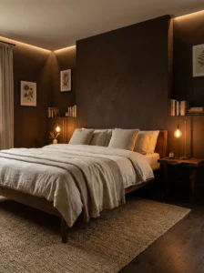
Deep, warm brown creates a genuinely enveloping, grounded mood that’s made a real comeback in recent years, moving past its earlier association with dated decor into something considerably richer when executed thoughtfully. I specified a deep, warm brown for a client’s bedroom, paired with brass hardware and warm textiles, and the resulting richness felt elegant rather than dated.
The key distinction from less successful brown rooms of the past comes down to depth and undertone, a warm, rich brown reads as considerably more current than flatter, more orange-leaning versions from earlier decades. I’d recommend testing your specific brown carefully, favoring a deeper, more saturated shade over anything lighter or more orange-toned.
I’d suggest pairing this mood with lighter bedding and textiles specifically, ensuring the room doesn’t feel overly heavy despite the substantial visual weight this deep color inherently carries.
22. Two-Tone Walls for Playful Balance
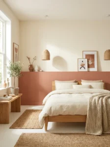
Rather than a single color, painting the lower half of a wall in one shade and the upper half in another creates a mood of playful, considered balance that a single flat color throughout can’t achieve on its own. I experimented with this in my own bedroom, pairing a deep terracotta on the lower half with a soft cream above, and it completely changed how the room felt, adding architectural interest that a single flat color simply couldn’t provide.
This approach works particularly well in bedrooms with lower ceilings, since a horizontal color break can actually make the room feel more dynamic and considered rather than flat. I’d recommend positioning this transition roughly one-third to halfway up the wall for the most intentional-looking result, using painter’s tape and a level for a clean, sharp line.
I’d suggest this mood specifically for anyone torn between two colors, rather than choosing just one, letting you combine a bolder, more saturated shade with a calmer neutral for genuine balance throughout the room.
23. Dusty Rose for Understated Romance
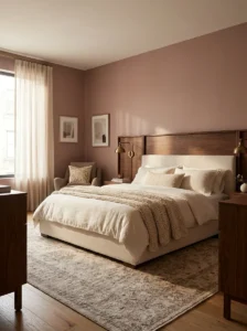
Dusty rose creates an understated, quietly romantic mood, distinct from the softer, paler quality of blush while still avoiding anything too bold or saturated. I used this shade in a client’s bedroom wanting something a touch more grown-up and grounded than blush but not as dramatic as a true burgundy, and the resulting mood felt genuinely romantic without tipping into anything overly sweet.
The slightly deeper, more muted quality compared to blush gives dusty rose a bit more visual weight and sophistication, making it feel considered rather than simply “pretty” in a more one-dimensional sense. I’d recommend pairing this mood with warm wood tones and brass accents, similar to guidance offered regarding several other warmer color choices throughout this list.
I’d suggest this shade specifically for anyone wanting the romantic quality of a pink-adjacent color without it reading as overly soft or lacking in genuine depth and character.
24. Warm White with a Single Bold Accent Wall
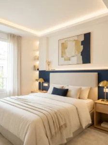
Rather than choosing a single mood-defining color throughout the entire room, keeping the majority of walls in a warm, versatile white while introducing one genuinely bold accent wall lets you experiment with dramatic mood shifts without fully committing an entire room to a single, potentially overwhelming choice. I’ve used this approach several times across different projects, most recently pairing warm white walls with a single deep navy accent wall behind the headboard, letting the room feel bright and versatile overall while still offering genuine drama and mood in one focused area.
This approach offers considerable flexibility, since the accent wall’s color can be changed relatively easily and affordably if your mood or taste shifts, while the surrounding warm white walls remain a stable, versatile foundation that doesn’t need to change alongside it. I’d recommend this specifically for anyone hesitant to commit to a bolder color throughout an entire bedroom, letting you test genuine mood-changing colors, navy, forest green, terracotta, in a smaller, more contained dose first.
I’d suggest choosing your accent wall specifically behind the headboard, ensuring the bold color choice becomes a genuine focal point for the room rather than feeling randomly placed on whichever wall happened to be available.
Final Thoughts
After testing more paint colors in our own bedroom than I can honestly count at this point, the one lesson that’s genuinely stuck with me is that there’s no single “correct” mood for a bedroom, only the mood that matches how you actually want to feel in that specific room. Before choosing any color from this list, spend a few days paying attention to how you naturally use your bedroom, whether you want it to feel like a calm, quiet escape or a bold, energizing space you’re excited to wake up in each morning.
Whatever mood you’re chasing, always test a sample directly on your own wall and observe it across different times of day before committing to a full room. The color on a paint chip or a screen rarely matches exactly how it will feel once it’s actually surrounding you in your own space, under your own specific lighting, and that small extra step has saved me from more than one repainting mistake over the years.