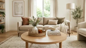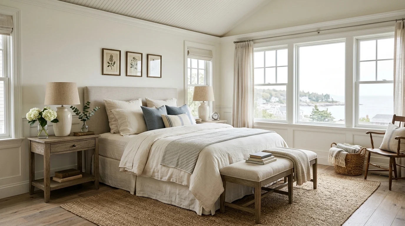
I still remember the first time I watched “Something’s Gotta Give” purely for the house. I know that sounds strange, but somewhere around the third viewing, I stopped paying attention to the plot entirely and started pausing scenes just to study the bedroom — the linen bedding, the soft blue-and-white palette, the way natural light poured through those oversized windows. That obsession eventually turned into an actual project when I redid my own bedroom a couple of years ago, chasing that exact “Nancy Meyers movie house” feeling: elegant, lived-in, coastal but never beachy-kitsch, warm but never cluttered.
It took a lot of trial and error. I bought the wrong white paint twice (turns out “white” has about forty different undertones and most of them look sterile in real light). I overspent on a headboard I later returned. I learned, slowly, what actually makes these rooms feel the way they do on screen versus what just looks like a generic coastal Pinterest board. Since then, I’ve helped a couple of friends chase the same aesthetic in their own homes, and I’ve picked up enough real, tested knowledge to put together this list properly.
Here are 25 Nancy Meyers-inspired bedroom ideas that capture that dreamy, cozy coastal charm — the kind of room that feels like it belongs in a movie about a woman who owns a beach house and somehow always has fresh flowers on her nightstand.
1. The Crisp White Linen Foundation

Everything in this aesthetic starts with linen, and I mean that almost literally. When I redid my bedroom, the single biggest change came from switching my old cotton-blend bedding for actual stonewashed linen sheets and a linen duvet cover in a soft ivory tone. Linen has this slightly rumpled, lived-in texture even right out of the wash, which is exactly the look these rooms have — put-together but never stiff or overly styled.
I layered a white linen duvet with a slightly heavier, textured white throw blanket folded at the foot of the bed, plus a mix of pillow sizes: two standard sleeping pillows, two Euro shams behind them, and a smaller lumbar pillow in a pale blue stripe for a touch of color without breaking the palette.
One thing I learned the hard way is that pure white bedding under warm-toned lighting can look slightly yellow or dingy rather than crisp. I switched my bedside lamp bulbs to a soft daylight tone (around 3000K-3500K) rather than the warmer 2700K bulbs I’d been using, and the white linens instantly looked cleaner and brighter.
If you’re building this look on a budget, start with just the duvet cover and one good throw blanket rather than buying an entirely new bedding set at once. The linen texture does most of the visual work, and you can slowly add in pillow variety over time as you find pieces you love.
2. Soft Coastal Blue Accent Walls
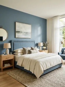
I was hesitant to add any color at first, worried it would clash with the neutral, airy feel I wanted. But a friend convinced me to try a single accent wall behind my headboard in a muted, dusty blue — something closer to a faded denim than a bright coastal blue — and it completely elevated the room without overwhelming it.
The key here is choosing a blue with gray undertones rather than a saturated, vibrant blue. Bright blues read as more playful or nautical-themed, while a muted, grayed-down blue feels sophisticated and calm, which is really the whole point of this aesthetic. I tested about six paint swatches on my wall before landing on one, and I’d genuinely recommend doing the same rather than trusting how a color looks on a small paint chip.
We painted just the wall behind the headboard rather than all four walls, which kept the room feeling open and let the color act as a backdrop rather than a dominant feature. The other three walls stayed a warm white, creating enough contrast to make the blue wall feel intentional rather than random.
Natural light changes how this color reads throughout the day, so I’d suggest testing your chosen paint color at different times — morning, midday, and evening — before committing to the full wall. My blue looked almost gray in the morning light and slightly more saturated in the evening, which I actually loved once I understood the shift instead of being caught off guard by it.
3. Oversized Windows with Sheer Curtains

If there’s one architectural element that defines the Nancy Meyers bedroom look, it’s abundant natural light pouring through large windows, often softened by simple, flowing sheer curtains rather than heavy drapes. I don’t have the luxury of floor-to-ceiling windows in my house, but I made the most of my standard-sized window by switching from heavy blackout curtains to lightweight linen sheers.
The curtains I chose were a soft off-white, hung from a rod mounted higher than the window frame itself — about six inches above — and extending slightly wider than the window on each side. This trick, which I picked up from a friend who works in interior design, makes windows appear larger and lets more light filter in even when the curtains are fully drawn.
For actual privacy and light control, I added a simple roller shade beneath the sheers, which stays hidden during the day but can be lowered at night without sacrificing the airy sheer curtain look during daylight hours.
I’ll admit I missed having blackout curtains for the first few weeks, especially on bright mornings, but the tradeoff in overall room atmosphere was worth it to me. If you’re someone who genuinely needs full darkness to sleep, consider a hybrid approach: sheers for the daytime look, paired with a discreet blackout liner or shade that can be adjusted only at night.
4. Layered Neutral Textures
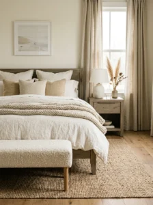
One thing that took me a while to understand is that these rooms rely heavily on texture variation rather than pattern or bold color to create visual interest. When my bedroom started feeling flat despite having the right color palette, a friend pointed out that everything was too smooth and similar — smooth cotton sheets, smooth painted walls, smooth wood furniture.
I started layering in texture deliberately: a chunky knit throw blanket, a woven jute rug beneath the bed, a linen (not cotton) duvet cover, and a slightly textured wool bench at the foot of the bed. Suddenly the room had depth even though the color palette stayed almost entirely neutral.
Texture also extends to furniture materials. I swapped a smooth, glossy nightstand for a slightly weathered, matte wood one, which fit the relaxed coastal feel far better than the shinier piece I’d had before. Mixing matte and slightly textured surfaces throughout the room — rather than anything glossy or overly polished — is really the secret to getting that lived-in, elegant feel rather than something that looks like a furniture showroom.
My advice if you’re working on this yourself: walk through your room and touch everything. If most surfaces feel the same (all smooth, all soft, all hard), that’s usually the reason a neutral room feels flat instead of cozy.
5. A Statement Four-Poster or Canopy Bed
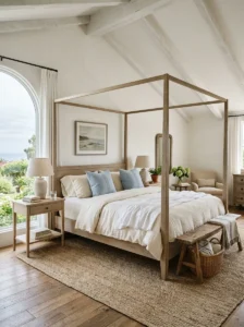
There’s a reason so many of these movie bedrooms feature a beautiful bed frame as the room’s centerpiece rather than hiding it under an enormous headboard covered in decorative pillows. When I finally upgraded from my old platform bed to a simple wooden four-poster frame, it genuinely changed how the entire room felt, even though nothing else in the space changed that day.
I chose a frame in a light, weathered wood tone rather than a dark, heavy wood, which kept the airy feeling intact instead of making the room feel formal or heavy. We skipped the canopy fabric entirely, since a full canopy can feel overwhelming in a smaller bedroom, and instead let the exposed posts themselves be the statement.
If a four-poster bed isn’t in the budget or doesn’t fit your space, a friend of mine achieved a similar effect with a simple upholstered headboard in a soft linen fabric, paired with a slightly higher-than-average bed frame height, which gave the room a similar sense of presence without the investment in a full four-poster frame.
One practical note: measure your ceiling height before committing to a four-poster or canopy frame. My room has slightly higher-than-average ceilings, and the proportions worked well, but the same frame in a room with lower ceilings can feel cramped rather than elegant.
6. Fresh Flowers as a Daily Ritual
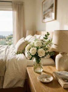
This might sound like a small detail, but it genuinely changed how my bedroom feels day to day. I started keeping a small vase of fresh flowers on my dresser, refreshed roughly once a week, after noticing just how often flowers appear in these movie bedrooms — always slightly imperfect, never overly arranged, just simple stems in a plain glass vase.
I began with inexpensive grocery store flowers rather than anything elaborate: a few stems of eucalyptus, some white ranunculus when in season, or simple garden roses. The goal isn’t a polished floral arrangement but something that looks like it was casually picked and placed, which fits the relaxed elegance of the overall aesthetic.
Beyond the visual impact, I noticed a genuine mood difference having something living and slightly fragrant in the room. It’s a small ritual, but it adds a layer of “cared for” feeling that’s hard to replicate with any other single object.
If fresh flowers aren’t practical for your budget or schedule, a few high-quality faux stems in a simple glass or ceramic vase can create a similar visual effect, though I’d still recommend real flowers when possible — even a single stem makes a noticeable difference in how finished a nightstand or dresser feels.
7. Warm Wood Furniture in Light Tones
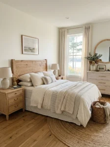
Dark, heavy wood furniture tends to make these coastal-inspired rooms feel formal or dated rather than relaxed and current. When I was furniture shopping for my own redo, I specifically looked for pieces in lighter wood tones — think whitewashed oak, weathered pine, or light ash — rather than the darker cherry or mahogany furniture I’d grown up with.
My dresser is a light oak piece with simple, unfussy hardware, and my nightstands are a slightly different but complementary light wood tone, which I learned is actually fine — these rooms rarely have perfectly matched furniture sets. A little variation in wood tone, as long as they’re in the same general family (light and warm rather than mixing light and dark dramatically), adds to the collected-over-time feeling rather than looking like a matching showroom set.
Hardware matters more than I initially expected. I swapped the dark bronze knobs on my dresser for simple brushed brass pulls, which tied in warmer metal accents throughout the room and matched better with the light wood tone than the darker hardware had.
If you already own darker wood furniture and can’t replace it right away, a light whitewash or pickling stain treatment can lighten existing pieces without a full replacement, which is exactly what I did with an old bookshelf I wasn’t ready to part with.
8. A Cozy Reading Nook by the Window
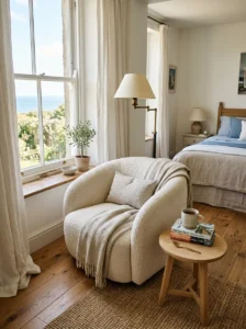
One of my favorite additions to my bedroom redo was carving out a small reading nook beside my window, inspired directly by scenes of characters curled up reading in these movie bedrooms. I didn’t have room for a full daybed, so I used a simple upholstered armchair in a soft, neutral bouclé fabric, paired with a small round side table and a floor lamp.
Positioning mattered a lot here. I placed the chair at a slight angle facing the window rather than directly toward it, which made the nook feel like a natural part of the room rather than an oddly placed extra piece of furniture. A folded throw blanket draped over the arm of the chair and a small stack of books on the side table completed the look without much additional cost.
Lighting for a reading nook needs to be functional as well as atmospheric. I chose a floor lamp with a warm-toned bulb and an adjustable arm, positioned so it cast light directly onto the reading area without creating glare on the window at night.
If your bedroom doesn’t have space for a full chair, even a simple window seat cushion on an existing windowsill or built-in ledge can create a similar cozy nook effect on a much smaller footprint, which is what a friend of mine did in her narrower bedroom.
9. Vintage-Inspired Nightstand Styling
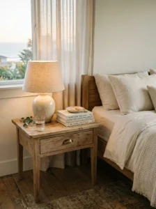
I used to just pile my phone charger, a lamp, and whatever book I was reading onto my nightstand without much thought. Once I started paying attention to how these movie bedrooms style their nightstands, I realized the “effortless” look actually comes from careful, minimal curation rather than true clutter.
My current nightstand setup includes a simple ceramic lamp with a linen shade, a small stack of two or three books (chosen partly for their spine color, which sounds vain but genuinely affects the overall look), a small dish for jewelry or odds and ends, and a single small glass for water. That’s it — nothing more.
I also learned that a slightly mismatched, vintage-feeling lamp adds more character than a brand-new, obviously modern one. I found mine at a secondhand shop for a fraction of what a comparable new lamp would have cost, and it fits the “collected over time” feeling far better than anything I could have bought new.
Cord management is a small but important detail here too — I used an adhesive cord clip to route my lamp’s cord neatly down the back leg of the nightstand rather than letting it dangle visibly, which keeps the styled surface from being undermined by a stray cord in plain view.
10. Plush Area Rugs Underfoot
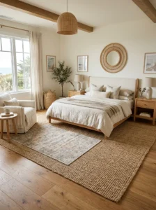
Hard flooring is common in a lot of these coastal-inspired homes, but bare floors alone can feel cold and unfinished in a bedroom. When I added a large jute area rug beneath my bed, extending a couple of feet past each side, it immediately grounded the room and added the textural warmth the space had been missing.
I specifically chose a natural fiber rug (jute or a similar woven texture) rather than a plush shag rug, since the woven texture fits the relaxed coastal aesthetic much better than something overly soft and modern-feeling. Layering matters too — a friend of mine layered a smaller, softer vintage-style rug on top of a larger jute rug near her reading chair, which added an extra pop of texture and a slightly worn-in character to that corner of the room.
Sizing was something I got wrong on my first attempt. I initially bought a rug too small for the room, which made the space feel choppy rather than pulled together. As a general rule, a rug under your bed should extend at least 18-24 inches beyond the sides and foot of the bed frame to properly anchor the furniture arrangement.
For anyone renting or hesitant to commit to a large natural fiber rug, a smaller runner-style rug along each side of the bed can create a similar grounding effect on a smaller budget, which is a compromise I used in my previous apartment before I had more flexibility to make bigger changes.
11. Soft, Diffused Overhead Lighting
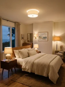
Harsh overhead lighting is probably the single fastest way to kill the cozy, cinematic atmosphere these bedrooms are known for. When I first moved into my house, the bedroom had a single bright overhead fixture that made the whole room feel more like an office than a bedroom, no matter how nicely everything else was styled.
I replaced the fixture with a simple flush-mount light in a soft linen or fabric shade, which diffuses the light rather than casting it in a harsh, direct beam. I also added a dimmer switch, which turned out to be one of the best small investments I made during the whole project — being able to lower the overhead light in the evening instantly changed the mood of the room.
Beyond the overhead fixture, I layered in additional light sources: the bedside lamps, the reading nook floor lamp, and a small plug-in sconce near my dresser. Having multiple lower, softer light sources rather than relying on one bright overhead light is really the secret to that warm, cinematic glow these rooms always seem to have.
If replacing your overhead fixture isn’t an option, even swapping to a warmer, dimmer bulb and relying more heavily on lamps for your primary lighting in the evening can create a similar effect without any electrical work.
12. A Neutral, Layered Color Palette Beyond White
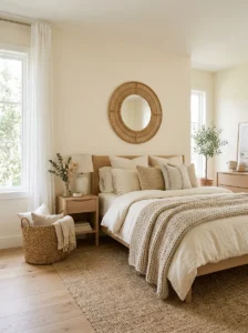
While white and cream form the base of this aesthetic, an entirely white room can start to feel sterile without some layered warmth added in. I learned this after my first attempt at the redo, which honestly looked a little too much like a hospital room until I started layering in warmer neutrals.
I introduced warmer tones through my bedding (a soft oatmeal-toned throw instead of another white one), my rug (a natural, slightly warm-toned jute rather than a cool gray), and small decor pieces like a rattan mirror frame and a woven basket for extra blankets. These warmer, earthy neutrals kept the room feeling soft and inviting rather than clinical.
I also learned to pay attention to undertones across different elements in the room. My walls had a very slightly cool white, while my bedding was a warmer ivory, and the contrast, while subtle, was enough to make the room feel slightly “off” until I repainted with a warmer white that better matched the rest of my palette.
The overall lesson here is that “neutral” doesn’t mean “all one shade of white.” A well-balanced neutral palette usually includes several closely related warm tones — ivory, oatmeal, soft tan, light wood — layered together, which creates depth without introducing any bold color.
13. Elegant, Minimal Wall Art
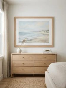
I used to think more wall art meant a more finished room, but these movie bedrooms actually tend to feature just one or two carefully chosen pieces rather than a gallery wall packed with frames. When I redid my own space, I removed about six smaller framed prints and replaced them with a single, larger piece of art above my dresser.
I chose a simple, muted landscape print in soft blues and creams, in a wide, light wood frame that matched my other furniture tones. The larger scale made a much bigger visual impact than the collection of smaller prints had, despite technically having less “stuff” on the walls.
Placement mattered as much as the art itself. I positioned the piece at roughly eye level from a standing position, centered above the dresser rather than off to one side, which gave the room a sense of intentional balance rather than a scattered, casual placement.
If a single large piece of original or print art isn’t in the budget, even a simple, oversized mirror in a light wood or rattan frame can serve a similar visual purpose, reflecting additional light around the room while still acting as a clean, elegant focal point on the wall.
14. A Cozy Upholstered Bench at the Foot of the Bed
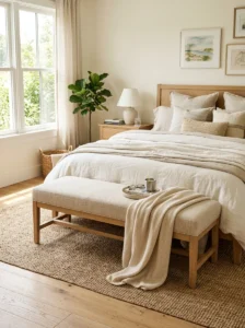
Adding a simple upholstered bench at the foot of my bed was a small change that made a surprisingly big difference in how “finished” the whole room felt. Beyond the visual impact, it’s also genuinely useful — a spot to sit while putting on shoes, or a place to lay out clothes the night before.
I chose a bench in a slightly textured, neutral linen fabric rather than anything patterned, keeping it in line with the rest of the room’s understated palette. The proportions mattered here too — I measured to make sure the bench was slightly narrower than my bed frame, which kept it looking proportionate rather than overwhelming the foot of the bed.
A folded throw blanket draped over one end of the bench added a bit of texture and made the piece feel styled rather than purely functional. I also learned that keeping the bench mostly clear, rather than using it as a dumping ground for clothes, was essential to maintaining the calm, put-together look — something I still have to consciously remind myself of some days.
If a full bench doesn’t fit your space or budget, even a simple woven basket or a folded quilt at the foot of the bed can add a similar layer of texture and function without requiring an additional furniture purchase.
15. Rattan and Wicker Accents
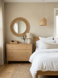
Rattan and wicker details show up constantly in coastal-inspired interiors, and after adding a few pieces to my own room, I understand why — they add texture and a relaxed, slightly organic feel without introducing any color or pattern that might clash with the rest of the palette.
I added a rattan mirror above my dresser, a small woven wastebasket, and a rattan-framed pendant light in my reading nook. Each piece was a relatively small, inexpensive addition, but together they added a cohesive textural thread running through the room.
One thing I’d caution against, based on my own early mistakes, is overdoing this element. My first attempt included a rattan headboard, a rattan mirror, and a rattan lamp base all in the same room, which ended up feeling more like a tropical resort than the elegant coastal look I was going for. I eventually removed the rattan headboard and kept just the smaller accent pieces, which struck a much better balance.
A good rule of thumb I’ve settled on: use rattan or wicker for two or three smaller accent pieces rather than any large-scale furniture item, unless the rest of your room is deliberately more casual or beach-house-specific rather than the elevated, movie-set elegance this particular aesthetic is going for.
16. Soft Striped or Textured Bedding Accents

While the base of the bedding stays neutral and solid, a subtle striped or textured accent piece adds just enough visual interest to keep the bed from looking flat. I added a single lumbar pillow in a soft, faded blue-and-white stripe, which echoed the accent wall color without introducing a second, competing pattern.
I specifically avoided anything with a bold, high-contrast stripe or nautical rope-and-anchor imagery, which tends to push the look toward “beach house kitsch” rather than the softer, more elegant coastal feel these rooms have. A muted, slightly faded stripe reads as sophisticated rather than themed.
Texture can serve a similar purpose to pattern here too. I added a waffle-weave throw blanket in a soft white, which has just enough textural pattern to catch the light and add interest without any actual color or print involved.
My advice, based on trial and error, is to introduce pattern in small doses — a single pillow, a folded throw — rather than a patterned duvet cover or sheet set, which can quickly overwhelm the otherwise calm, neutral base of the room.
17. A Simple, Elegant Chandelier or Pendant Light
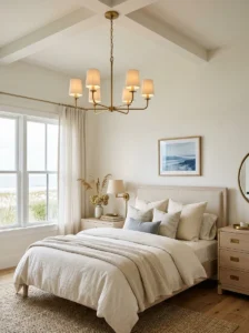
Beyond the general overhead lighting fix, adding a specific statement fixture — something small and elegant rather than large and ornate — can genuinely transform a bedroom’s character. I added a small, simple linen or rattan drum pendant light in my reading nook, which became a subtle focal point in that corner of the room.
For the main bedroom light, a friend of mine replaced her standard flush-mount fixture with a small, understated chandelier featuring simple glass or linen shades rather than anything ornate or crystal-heavy, which fits the relaxed elegance of this aesthetic far better than a more traditional, formal chandelier would.
Scale is important here — an oversized or overly ornate fixture can quickly tip a room from “elegant coastal” into something closer to a formal dining room. I’d recommend measuring your ceiling height and room size carefully before choosing a fixture, erring toward something smaller and simpler rather than a large, elaborate piece.
If a full fixture replacement isn’t possible, even a simple pendant light shade cover, which fits over an existing basic fixture, can update the look for a fraction of the cost of a full replacement, which is exactly what I did in my reading nook before eventually upgrading to a proper rattan pendant.
18. Layered Curtains for Depth
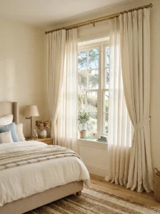
Beyond the simple sheer curtains I mentioned earlier, I eventually added a second layer — a slightly heavier linen curtain panel on the outer track — which added depth and gave me more flexibility for controlling light and privacy throughout the day.
The heavier panels stay open most of the time, pulled back with simple fabric tiebacks, but can be closed in the evening for additional privacy and warmth without losing the airy sheer curtain look during the day. This layered approach is something I noticed repeatedly in these movie bedrooms — curtains are rarely just one single layer.
I chose the heavier panels in the same ivory tone as my sheers rather than introducing a new color, which kept the window treatment feeling cohesive rather than busy. The slight difference in fabric weight and texture between the two layers was enough to add visual interest without needing any color contrast.
Hardware for layered curtains matters more than it seems — I used a double curtain rod specifically designed for layering, which kept both panels running smoothly on their own tracks rather than tangling together, a small but important detail I wish I’d known before my first attempt with a single rod and clips.
19. A Dedicated Vanity or Dressing Corner
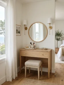
One detail I noticed repeatedly in these movie bedrooms is a small, dedicated vanity or dressing area, separate from the main bed and storage furniture. I didn’t have room for a full vanity table, but I created a small dressing corner using my existing dresser, adding a simple round mirror and a small stool tucked underneath.
The mirror I chose had a thin, light wood frame, positioned at a height appropriate for sitting on the stool while doing hair or makeup, rather than the higher placement I’d originally used for a purely decorative wall mirror. A small tray on the dresser surface holds a few curated beauty items and a small dish for jewelry, keeping the space functional without looking cluttered.
Lighting for a dressing area needs to be functional, ideally from the sides rather than just overhead, to avoid harsh shadows. I added a small plug-in sconce on either side of the mirror, which made a genuine difference for actual daily use, not just the aesthetic.
If you don’t have space for even a small stool, simply designating one end of an existing dresser as a “vanity corner,” complete with a mirror and a tray of curated items, can achieve a similar effect without requiring any additional furniture.
20. Soft, Rounded Furniture Silhouettes
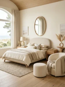
I noticed that a lot of the furniture in these movie bedrooms has soft, rounded edges rather than sharp, angular lines — rounded nightstand corners, curved chair backs, oval mirrors. When I was furniture shopping, I started specifically looking for these softer silhouettes rather than the more modern, geometric pieces I’d been drawn to before.
My new nightstands have gently rounded corners and a slightly curved base, which look noticeably softer next to my bed than the sharp-edged pieces they replaced. My reading chair has a rounded, slightly barrel-shaped back rather than a squared-off silhouette, which fits the relaxed, elegant feeling of the room far better.
This detail is subtle, and I don’t think I would have consciously noticed it without paying close attention to these specific movie sets, but once you start looking for it, the difference between rounded and angular furniture silhouettes in this particular aesthetic becomes obvious.
If replacing furniture entirely isn’t practical, even small swaps — a rounded mirror instead of a rectangular one, a curved lamp base instead of a geometric one — can shift the overall feel of the room toward that softer, more elegant silhouette without a complete furniture overhaul.
21. A Calming Scent Layer
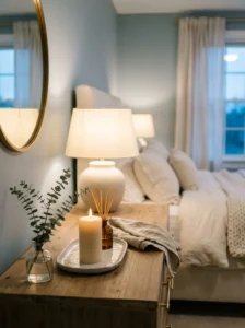
This is a detail that doesn’t show up on camera but genuinely affects how a room feels in person. I started keeping a simple, high-quality candle on my dresser — something in a fresh, slightly herbal or linen-inspired scent rather than anything overly sweet or heavily perfumed — and lighting it most evenings before bed.
I also added a small diffuser with a subtle eucalyptus or fresh linen scent for daytime use, since burning a candle isn’t always practical or safe to leave unattended. The goal is a scent that’s barely noticeable rather than overpowering — something that makes the room feel fresh and cared for without announcing itself the moment you walk in.
Linen spray became part of my regular routine too, lightly misted on my sheets a couple of times a week, which added a subtle, clean scent to the bedding itself, similar to how professionally styled hotel rooms often smell.
This is a low-cost, easy addition that doesn’t affect the visual design at all but genuinely impacts how “finished” and cared-for a room feels, which is a big part of what makes these movie bedrooms feel so aspirational beyond just their visual styling.
22. Functional Yet Beautiful Storage Baskets
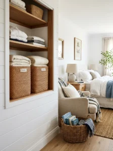
Real bedrooms need storage for extra blankets, pillows, and everyday items, and I learned that woven baskets solve this practically while still fitting the aesthetic perfectly. I added two large woven baskets in my closet nook — one for extra linens and one for out-of-season throw blankets — which kept the room feeling tidy without requiring bulky, visible storage furniture.
I chose baskets with simple, tight weaves rather than anything overly rustic or chunky, since the finer weave felt more elevated and matched the overall refined feel of the room better than a more casual, farmhouse-style basket would have.
A smaller basket on the floor beside my reading chair holds current books and a spare throw blanket, replacing what used to be a small stack of items just piled on the floor. This small change alone made that corner of the room look significantly more intentional.
The general principle I’ve settled on is that visible storage should always be attractive enough to double as decor. If a storage solution wouldn’t look good sitting out in plain view, it’s usually better tucked inside a closet or drawer rather than left visible in the main room.
23. A Muted, Sophisticated Color Palette for Accessories
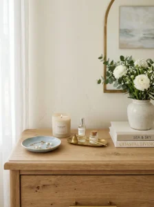
Beyond the wall color and bedding, I learned that even small accessories need to stay within the same muted, sophisticated palette to avoid disrupting the overall calm of the room. Early on, I had a bright yellow candle and a colorful ceramic dish on my dresser that, in isolation, seemed harmless but actually clashed with everything else once I looked at the room as a whole.
I replaced these with pieces in soft, muted tones — a pale blue ceramic dish, an unscented cream-colored candle, a small brass tray — all of which fit within the same restrained color family as the rest of the room. The difference was subtle individually but added up to a much more cohesive overall look.
I now generally test new accessories by holding them up against my existing palette before bringing them into the room permanently, which sounds slightly obsessive, but it’s saved me from several purchases that would have disrupted the calm, cohesive feeling I worked hard to build.
If you’re working on this yourself, a good practical tip is to photograph your room periodically and review the photo rather than judging the space only in person — clashing colors and undertones are often easier to spot in a photograph than in the room itself.
24. A Sense of Curated, Personal History
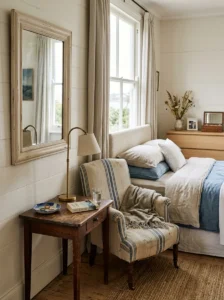
One thing that struck me while studying these movie bedrooms more closely is that they never feel like everything was bought at once from the same store. There’s usually a mix of eras and origins — a vintage lamp, an inherited mirror, a newer piece of furniture — that gives the room a sense of accumulated, personal history rather than a single showroom purchase.
I intentionally left a couple of older pieces in my own redo rather than replacing everything: an old wooden mirror frame that belonged to my grandmother, repainted in a soft white to fit the new palette, and a small ceramic dish I’d had since college. These pieces added a layer of authenticity that brand-new furniture alone couldn’t replicate.
If you’re starting from scratch without existing sentimental pieces, secondhand shops and estate sales are a great source for this kind of character. I found my reading nook side table at a local secondhand shop, and its slightly imperfect, worn finish adds exactly the kind of “collected over time” feeling that a brand-new piece wouldn’t have provided.
This detail is less about a specific product and more about a mindset: resist the urge to buy an entire room’s worth of furniture from a single source, and instead let the space develop a bit more organically over time.
25. Bringing It All Together with Restraint
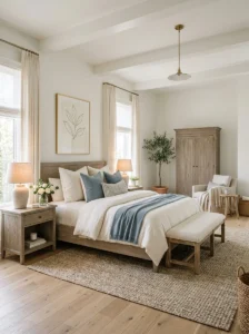
After going through this entire process myself, the single biggest lesson I learned is that restraint is really the defining feature of this whole aesthetic. Every individual element on this list is fairly simple on its own — linen bedding, a muted color palette, some rattan accents, soft lighting — but the overall effect only works if you resist the urge to add too much at once.
My first attempt at this redo genuinely failed because I tried to incorporate almost everything on this list simultaneously, which resulted in a room that felt busy and overdone rather than calm and elegant. It wasn’t until I started removing things — an extra throw pillow here, a redundant decorative object there — that the room actually started to feel like the movie bedrooms I’d been referencing.
My advice, based on that experience, is to pick just three or four elements from this list to start with — maybe the linen bedding, a muted accent wall, better lighting, and one or two rattan accents — and live with the room for a few weeks before adding anything else. This slower, more intentional approach almost always produces a better result than trying to transform the entire room in a single weekend.
Frequently Asked Questions
What paint colors work best for a Nancy Meyers-inspired bedroom? Soft, warm whites and muted, gray-toned blues work best. Avoid stark, cool whites or overly saturated colors, which tend to feel either sterile or too playful for this aesthetic.
Is this style expensive to achieve? Not necessarily. Many of the most impactful changes — better lighting, fresh flowers, decluttering, layering textures — cost very little. The overall look comes more from restraint and thoughtful curation than from expensive furniture.
Can this aesthetic work in a small bedroom? Yes. Several of the tips above, like layered lighting, a single statement art piece, and careful texture layering, work just as well, if not better, in smaller spaces where a few well-chosen elements have more visual impact.
How do I avoid making the room look too “beachy” or themed? Stick to muted, faded tones rather than bright nautical colors, and avoid literal beach-themed decor like shells, anchors, or rope details. The look should feel elegant and coastal-adjacent, not literally beach-house themed.
Final Thoughts
Chasing this exact aesthetic in my own home taught me a lot more than I expected about restraint, texture, and the difference between a room that looks styled versus one that simply feels calm and lived-in. If you’re working on your own version of this cozy coastal charm, start slow, focus on lighting and texture before anything else, and resist the urge to buy everything at once. The rooms that feel the most like these movie sets are almost always the ones that were built patiently, one thoughtful piece at a time.