A couple of years ago, I bought a house built in 1962 that still had most of its original kitchen layout, though obviously not the original appliances or finishes at that point. Instead of gutting it entirely and going fully contemporary, something a lot of my friends assumed I’d do, I found myself increasingly drawn to honoring the home’s actual era, researching mid-century modern kitchen design and trying to figure out how to bring that retro charm back without creating something that felt like a museum exhibit rather than an actual, functional kitchen I’d use every day.
That project taught me a lot about the specific details that define genuine mid-century modern style, as opposed to a more generic, loosely “vintage-inspired” look. It’s a surprisingly precise aesthetic, built around clean geometric lines, specific color palettes, and particular material choices from that era, and getting it right required real research rather than just grabbing anything that looked vaguely old-fashioned. I made a few missteps early on, choosing finishes that read more “farmhouse” than genuinely mid-century, before I understood the difference clearly enough to execute it properly.
Since finishing my own kitchen, I’ve helped a friend with a similar-era home navigate her own renovation too, which gave me a broader sense of what actually works in practice, not just in reference photos. Here are 17 mid-century modern kitchen ideas I’ve personally tested or helped implement, all aimed at capturing that genuine retro charm in a way that functions beautifully for how people actually cook and live today.
1. Choose Warm Walnut or Teak Cabinetry
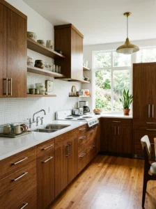
The defining material choice in genuine mid-century design is warm, richly grained wood, specifically walnut or teak, rather than the painted white or gray cabinetry common in a lot of contemporary kitchens. When I redid my own kitchen, I chose walnut-veneer cabinetry with a simple, flat-panel door style, no raised molding or ornate detailing, which is exactly the clean, minimal profile genuine mid-century furniture and cabinetry favored.
I specifically avoided anything with a distressed or heavily textured finish, since the original mid-century aesthetic favored smooth, polished wood surfaces that showcased the natural grain clearly, rather than an artificially aged or roughened texture that some more generic “retro” products mistakenly apply. Getting a genuinely accurate walnut tone also mattered, I tested several stain samples before settling on one with the right warm, reddish-brown depth that matched actual mid-century furniture pieces I’d researched as reference points.
For anyone unable to afford full walnut veneer cabinetry, several manufacturers now offer laminate or engineered wood options specifically designed to mimic this same warm wood grain and tone, providing a similar visual effect at a considerably lower cost than genuine solid walnut construction throughout an entire kitchen’s worth of cabinetry.
2. Add Tapered, Angled Cabinet Legs
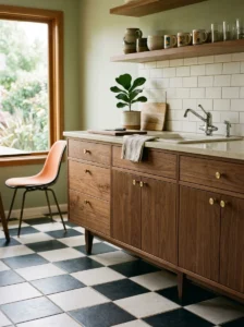
One of the most recognizable structural details in genuine mid-century furniture design is the tapered, angled leg, and I incorporated this same detail into my kitchen’s lower cabinetry by choosing a floating cabinet style with visible, angled wood legs rather than a standard flush, floor-to-cabinet base design.
This detail required specifically seeking out cabinetry manufacturers or custom builders familiar with this particular structural style, since it’s considerably less common in standard, mass-produced modern kitchen cabinetry, which typically uses a flush toe-kick base rather than visible, angled legs. The floating appearance this created, with a visible gap of a few inches between the cabinet bottom and the floor, added genuine period authenticity while also making the kitchen feel slightly more open and less visually heavy than a standard flush-base cabinet run would have.
For anyone working with existing standard cabinetry who wants to introduce this same detail without a full replacement, some retailers offer add-on tapered leg kits designed to attach to existing cabinet bases, providing a similar visual effect at a considerably lower cost than replacing the cabinetry entirely.
3. Incorporate a Bold, Saturated Accent Color
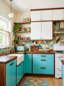
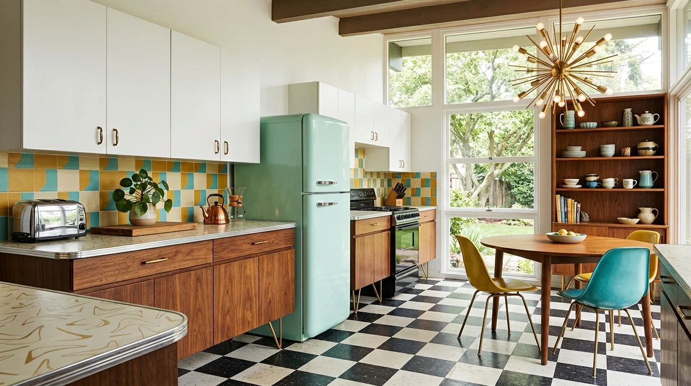
Mid-century design is known for its confident use of bold, saturated colors, mustard yellow, burnt orange, avocado green, turquoise, typically as an accent against a more neutral base rather than throughout the entire space. I chose a deep turquoise for my kitchen’s lower cabinet run along one wall, keeping the upper cabinets and remaining walls in a warmer white to balance out the boldness.
Getting the specific shade right mattered enormously here, a slightly wrong turquoise, either too bright and modern or too muted and contemporary-gray, would have undercut the period authenticity I was going for. I researched actual mid-century paint chip references and appliance color options from the era to calibrate my color choice more precisely than working from general color intuition alone.
I’d recommend, for anyone incorporating this kind of bold accent color, limiting it to one specific application, cabinetry, a single accent wall, a backsplash, rather than spreading it across too many different surfaces, which keeps the overall kitchen feeling balanced and current rather than like an overwhelming, dated color explosion throughout the entire room.
4. Choose Retro-Inspired Appliances
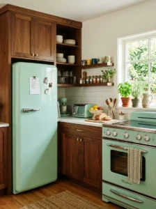
Beyond cabinetry and color, my appliance choices played a significant role in the kitchen’s overall period character. I chose a retro-styled refrigerator with rounded corners and a simple, curved silhouette reminiscent of actual mid-century appliance design, alongside a range with similar rounded detailing and classic knob-style controls rather than a sleek, flat modern touch panel.
Several major appliance manufacturers now offer these kinds of retro-styled options specifically designed to reference mid-century era appliances while still including entirely modern functionality and efficiency standards inside, which let me get genuine period visual character without sacrificing actual modern cooking and refrigeration performance.
I’d recommend, for anyone considering this route, researching the specific manufacturer’s retro line carefully, since quality and authenticity of the retro styling varies considerably between different brands, some genuinely capture the era’s specific curves and proportions accurately, while others apply only a loose, generic “vintage” styling that doesn’t quite match true mid-century design details as precisely.
5. Use Geometric Tile Patterns
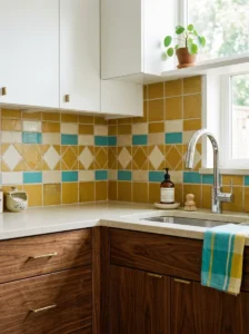
For my kitchen’s backsplash, I chose a simple geometric tile pattern, specifically a repeating diamond and rectangle combination in two complementary colors, rather than the more common subway tile pattern that, while classic, doesn’t specifically evoke this particular design era the way genuinely geometric patterns do.
Mid-century design favored these kinds of clean, repeating geometric patterns extensively, not just in tile but throughout textiles, wallpaper, and furniture upholstery patterns from the era as well. I researched actual period tile patterns before selecting mine, ensuring the specific geometric shapes and their arrangement genuinely reflected authentic mid-century design sensibilities rather than a more generic, contemporary geometric pattern that merely looked vaguely retro without specific historical grounding.
For anyone hesitant to commit to a full geometric tile backsplash, even incorporating this kind of pattern in a smaller, more contained area, a tiled accent strip, a small kitchen nook, can introduce this same period-appropriate detail without the cost and commitment of a full kitchen’s worth of patterned tile.
6. Add Sputnik-Style or Globe Pendant Lighting
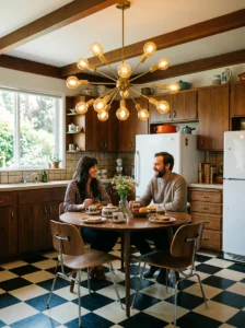
Lighting fixtures offer one of the clearest opportunities to introduce genuine mid-century character, and I chose a Sputnik-style pendant fixture, featuring the characteristic starburst arrangement of metal rods with small globe bulbs at each end, positioned above my kitchen’s small breakfast nook table specifically.
This particular fixture style is instantly recognizable as belonging to this specific design era, and finding a genuinely well-proportioned, quality version, rather than an oversized or cheaply constructed reproduction, took some careful shopping and comparison between several different retailers before I found one with the right scale and build quality for my specific space.
For general kitchen task lighting elsewhere in the room, I chose simpler, clean-lined globe pendants rather than more elaborate fixtures, reserving the more dramatic Sputnik-style piece specifically for the breakfast nook as a genuine statement feature, rather than using multiple dramatic fixtures throughout the kitchen, which would have competed with each other rather than each having room to stand out individually.
7. Choose a Boomerang or Atomic-Pattern Laminate Countertop
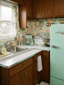
For my kitchen’s countertops, rather than a more contemporary quartz or granite option, I chose a laminate countertop featuring a classic boomerang or “atomic” pattern, a specific style of abstract, curved geometric design closely associated with the mid-century era, particularly for kitchen and diner-style countertop surfaces.
This specific laminate pattern required some searching to find a genuinely accurate reproduction, since many contemporary laminate options offer more generic abstract patterns that don’t specifically reference this particular historical design style. I eventually found a specialty laminate manufacturer that produces historically accurate reproductions of several specific mid-century patterns, which provided the authentic look I was after.
Beyond the aesthetic authenticity, laminate also offered a practical benefit consistent with the era itself, since laminate countertops were themselves a genuinely popular, practical choice during the actual mid-century period, making this material choice historically accurate in substance as well as pattern, rather than simply applying a retro-look surface treatment to a more contemporary countertop material.
8. Incorporate Chrome or Brushed Steel Hardware
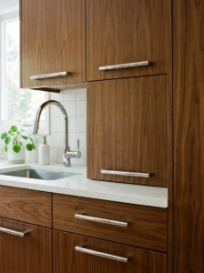
Throughout my kitchen, I chose simple, clean-lined chrome hardware, cabinet pulls, faucet fixtures, and light switch plates, rather than the matte black or brushed brass finishes more common in a lot of contemporary kitchen design. Chrome and brushed steel were the dominant metal finishes throughout the actual mid-century era, and using them consistently throughout my kitchen’s hardware reinforced the overall period authenticity established through the cabinetry and appliance choices.
I specifically chose hardware with simple, geometric shapes, straight bar pulls and simple round knobs, rather than anything more ornate or elaborately shaped, consistent with the clean, minimal detailing typical of genuine mid-century design across furniture, fixtures, and architectural hardware alike.
For anyone renovating an existing kitchen without wanting to replace cabinetry entirely, swapping just the hardware to this kind of simple chrome finish can meaningfully shift a kitchen’s overall character toward this aesthetic, even without addressing the larger, more expensive elements like cabinetry, countertops, or appliances.
9. Add a Breakfast Nook With Vinyl Booth Seating
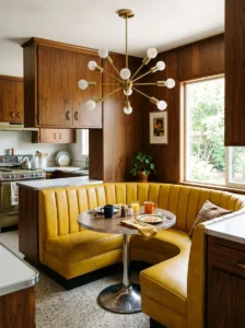
A genuinely charming addition to my kitchen was a small breakfast nook featuring built-in bench seating upholstered in a period-appropriate vinyl material, in a warm mustard yellow tone, paired with a simple round table with a chrome pedestal base, closely referencing actual diner and kitchen nook seating common throughout the mid-century era.
This required some custom carpentry work to build the actual bench structure, but the vinyl upholstery itself was relatively straightforward to source and install, and it provided genuine practical durability advantages beyond just its period-appropriate styling, being considerably easier to wipe clean after spills than a fabric upholstery option would have been for this specific high-use dining area.
I’d recommend, for anyone incorporating this kind of nook seating, researching actual period color and pattern references carefully, since certain vinyl colors and patterns read as more convincingly authentic to this specific era than others, some more contemporary vinyl colorways, despite being technically similar materials, don’t quite capture the same period-accurate visual character.
10. Use a Two-Tone Cabinet Color Scheme
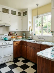
Rather than a single uniform cabinet color throughout, I used a two-tone approach in my kitchen, warm walnut wood cabinetry on the lower run and simple white upper cabinets, a combination genuinely common in actual mid-century kitchen design, which often paired warm wood tones with crisp white or pastel-colored upper elements.
This two-tone approach also provides a practical visual benefit beyond period authenticity, keeping the upper cabinetry area feeling lighter and less visually heavy than an entirely wood-toned kitchen might, while the warmer wood lower cabinets still provide genuine material richness and warmth at the kitchen’s main working level.
I’d recommend, for anyone considering this combination, researching specific period-appropriate color pairings rather than assuming any wood-and-white combination automatically reads as authentically mid-century, since the specific proportions and exact color choices matter considerably for achieving a genuinely accurate period look rather than a more generic, contemporary two-tone kitchen scheme that merely happens to share the same basic wood-and-white color structure.
11. Add Starburst or Atomic-Pattern Wallpaper
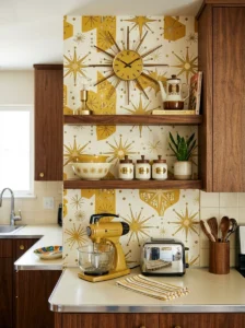
For a small accent area in my kitchen, a narrow wall section near the pantry, I added wallpaper featuring a classic atomic-era starburst pattern, in gold and cream tones, providing another clearly recognizable period design reference distinct from the geometric tile pattern used elsewhere in the room.
I limited this wallpaper to just this smaller, contained area rather than a larger expanse of wall, since this kind of bold, pattern-heavy wallpaper can quickly become overwhelming if applied too extensively throughout a kitchen, particularly one already incorporating several other patterned and colored elements throughout the space.
For anyone considering this addition, choosing a wallpaper specifically marketed as a mid-century reproduction pattern, rather than a more generic, loosely “retro-inspired” contemporary pattern, provides considerably more genuine period accuracy, and several specialty wallpaper companies now specifically focus on historically accurate reproductions of patterns from this specific design era.
12. Choose a Round or Boomerang-Shaped Dining Table
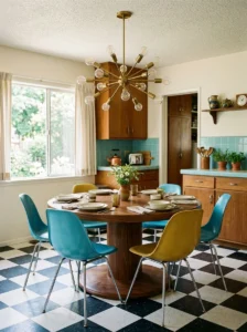
Beyond the built-in nook seating mentioned earlier, for a more flexible dining option, a round table with a simple pedestal base, or alternatively a boomerang-shaped table with tapered, angled legs, both reference classic mid-century furniture silhouettes considerably more accurately than a standard rectangular table with straight, uniform legs.
A friend incorporating this same design approach chose a boomerang-shaped table specifically, finding an authentic vintage piece through an estate sale rather than a new reproduction, which added genuine period authenticity that even a well-made new reproduction piece couldn’t quite replicate to the same degree.
For anyone unable to source a genuine vintage piece, several furniture manufacturers now produce well-made reproductions of these classic mid-century table shapes, providing similar visual authenticity without requiring the sometimes unpredictable process of finding a genuine vintage piece in good structural condition through estate sales or antique shops.
13. Incorporate Warm Wood Open Shelving
Beyond closed cabinetry, I added a small run of open wood shelving in the same warm walnut tone as my lower cabinets, displaying a curated selection of vintage-style dishware and glassware, adding both functional storage and another opportunity to showcase the warm wood material central to this aesthetic throughout an additional element of the kitchen.
I specifically sought out dishware in period-appropriate colors and shapes, simple, rounded forms in pastel or earth-toned colors reminiscent of actual mid-century dinnerware lines, rather than more contemporary, angular dish shapes that would have looked visually out of place against the otherwise carefully curated period styling throughout the rest of the kitchen.
This kind of curated open shelving display requires ongoing attention to keep genuinely styled and organized, but it provides a meaningful opportunity to extend the kitchen’s period character into smaller, more personal decorative details beyond just the larger structural and material choices covered elsewhere in this list.
14. Add a Vintage-Style Clock as a Focal Point
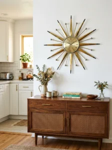
A small but genuinely charming addition to my kitchen was a wall-mounted, starburst-style clock, similar in visual language to the Sputnik pendant light mentioned earlier, positioned as a focal point on an otherwise simple, unadorned wall section.
This kind of statement clock is a genuinely common feature in actual mid-century kitchens, functioning as both a practical timepiece and a decorative, sculptural wall element, and finding a well-proportioned, quality reproduction, rather than an oversized or cheaply constructed version, made a meaningful difference in how authentically this particular detail read within the overall kitchen design.
I’d recommend, for anyone incorporating this kind of statement clock, positioning it on a wall with enough surrounding open space for it to genuinely stand out as a focal point, rather than crowding it among other busy decorative elements, which allows this specific detail to read clearly as an intentional design statement rather than getting visually lost among competing surrounding decor.
15. Use Terrazzo or Checkerboard Flooring
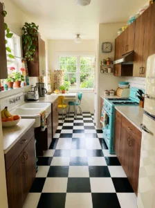
For my kitchen floor, I chose a black and white checkerboard pattern, using large-format vinyl tile for practical durability and cost reasons rather than genuine period materials, which closely references classic mid-century and diner-style flooring patterns from the era.
A friend pursuing a similar aesthetic in her own kitchen instead chose terrazzo flooring, another material closely associated with mid-century design, featuring small chips of stone or glass embedded within a concrete or resin base, creating a distinctive speckled pattern also common throughout this particular design period.
Both flooring approaches provide strong period authenticity, and the choice between them often comes down to budget and specific aesthetic preference, checkerboard tends to be more affordable and dramatic in its high contrast, while terrazzo offers a more subtle, textured period reference that some might find pairs more elegantly with a wider range of other design elements throughout the kitchen.
16. Choose Pastel or Earth-Toned Small Appliances
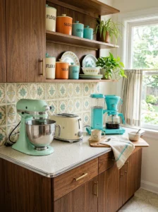
Beyond the major appliances mentioned earlier, I chose smaller countertop appliances, a toaster, a stand mixer, a coffee maker, all in coordinating pastel or earth-toned colors, mint green and cream specifically, rather than the stainless steel or matte black finishes more common in a lot of contemporary kitchen small appliances.
This kind of coordinated small appliance color scheme provides another layer of period authenticity throughout the kitchen’s daily-use items, extending the overall aesthetic beyond just the larger structural and fixed elements into the smaller, more frequently handled objects that genuinely populate daily kitchen use and activity.
Several small appliance manufacturers now offer retro-styled color options specifically designed to reference this era’s typical appliance color palette, making this a relatively accessible way to extend the kitchen’s overall period character into these smaller daily-use items without requiring the larger investment associated with major structural renovation elements covered elsewhere throughout this list.
17. Balance Retro Charm With Genuine Modern Function
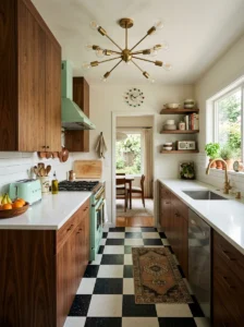
The final and most important lesson from my own kitchen renovation is that a truly successful mid-century modern kitchen still needs to function excellently by today’s practical cooking and living standards, rather than sacrificing genuine functionality purely for the sake of strict period accuracy throughout every single element.
I made sure my appliances, despite their retro styling, included fully modern energy efficiency and functionality, and I incorporated contemporary conveniences like adequate electrical outlets and proper ventilation, discreetly integrated in ways that didn’t visually undermine the overall period aesthetic but still provided genuinely modern practical performance throughout daily use.
This balance, authentic mid-century style layered over solid modern function, is really what separates a genuinely successful, livable mid-century modern kitchen from one that simply looks the part without accounting for how people actually cook, store food, and live in their kitchens today. The goal throughout this whole project was charm and character, not an impractical, purely nostalgic recreation that sacrifices genuine daily usability for strict historical accuracy.
Frequently Asked Questions
Is mid-century modern kitchen design expensive to achieve? It varies depending on your choices. Genuine vintage pieces and custom elements like tapered cabinet legs can increase costs, while starting with hardware swaps, a bold accent color, and retro-styled small appliances offers a more budget-friendly entry point into this aesthetic.
Can I achieve this look in a newer, non-mid-century home? Yes, though it requires more intentional design choices since you won’t have the original architectural bones to work from. Focus on the specific material, color, and furniture silhouette details covered throughout this list rather than relying on existing architecture to establish the period character.
Where can I find authentic mid-century kitchen fixtures and furniture? Estate sales, vintage furniture shops, and architectural salvage yards are good sources for genuine period pieces, while several manufacturers also offer well-researched, historically accurate reproductions for those unable to source or restore authentic vintage items.
How do I avoid making a mid-century kitchen feel dated rather than charming? Balance genuine period details with modern function and a restrained overall palette, limiting bold colors and patterns to a few focal areas rather than applying them throughout every single surface in the kitchen.
Final Thoughts
Choosing to honor my 1962 house’s original character rather than gutting it for something more generically contemporary turned out to be one of the most rewarding renovation decisions I’ve made, teaching me just how precise and intentional genuine mid-century design actually is once you look past the surface-level associations most people have with the era. The core lesson across all seventeen of these ideas is balance, authentic period materials and details layered thoughtfully alongside genuinely modern function, rather than either extreme on its own. Start with the foundational choices, cabinetry, color, and one or two statement pieces, and let the smaller period details accumulate gradually from there.