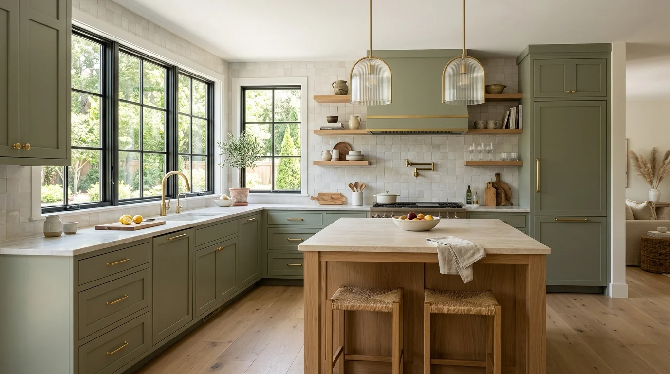
I still remember standing in the paint aisle for nearly an hour trying to decide on cabinet colors for our own kitchen renovation a few years back, completely overwhelmed by how many “safe” whites and greys were being pushed as the only sensible options at the time. We eventually went with a warm sage green instead, against the advice of more than one well-meaning friend who insisted we’d regret straying from a neutral, and it remains one of the best decisions we made in that entire renovation. That experience taught me that the “trending” color isn’t always the boldest new thing, sometimes it’s simply permission to move past whatever felt like the only acceptable choice a few years earlier.
Since then, I’ve kept a close eye on what colors designers are actually specifying for kitchens, both through projects I’ve worked on directly and through conversations with other people in the industry. Below are 25 kitchen cabinet colors currently getting genuine attention from designers, based on real projects and real reasoning for why each one works, not just a trend list assembled from a single mood board.
1. Warm Sage Green
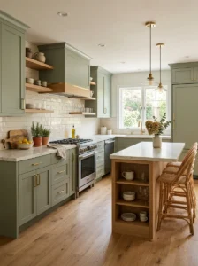
Sage green has moved well beyond trend status into what I’d now call a genuinely enduring choice, and it remains the color I recommend most often to clients nervous about committing to anything beyond white or grey for their cabinets. Our own kitchen has been sage for several years now, and I’ve genuinely never tired of it, largely because it sits in that comfortable middle ground between a true, adventurous color and a safe neutral.
What makes sage work so consistently well is its relationship to natural materials. It pairs beautifully with wood countertops, brass hardware, and warm-toned stone, all of which are themselves fairly enduring kitchen material choices, meaning the whole space tends to feel cohesive rather than built around a single trendy color that might eventually feel disconnected from everything else in the room.
I’d recommend a slightly muted, greyed-down sage specifically over a brighter, more saturated green, since the muted version reads as considerably more sophisticated and less likely to feel dated a decade from now. Testing your specific sage choice against your actual countertop and flooring materials before committing is genuinely worth the extra step, since sage can shift noticeably warmer or cooler depending on what it’s paired with.
2. Deep Navy Blue
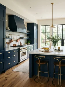
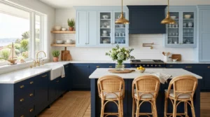
Navy has held a consistent place in designer kitchen recommendations for years now, and its staying power comes down to how effectively it reads as both bold and genuinely sophisticated at the same time, a combination that’s harder to find than it sounds. A client’s kitchen I worked on last year used navy lower cabinets paired with white uppers, and the resulting contrast gave the kitchen a crisp, considered look that photographed beautifully but also held up wonderfully in person, day to day.
The specific navy shade matters considerably here, a navy leaning slightly toward black reads as more dramatic and modern, while one with a bit more visible blue undertone feels warmer and slightly more traditional. I’d recommend testing your chosen navy in your kitchen’s actual lighting before committing, since navy can shift quite noticeably between looking rich and sophisticated versus flat and slightly muddy depending on the specific light exposure in your space.
Navy pairs particularly well with brass or warm gold hardware, which lifts the color and prevents it from feeling too heavy or somber, especially when used across full-height cabinetry rather than just a lower run. I’d suggest this combination specifically for kitchens with decent natural light, since navy in a genuinely dim room can start to feel more oppressive than intentionally dramatic.
3. Warm Terracotta
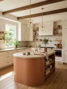
Terracotta has emerged as one of the more surprising colors gaining real traction in kitchen design recently, moving well beyond its more expected use in bedrooms or living spaces into cabinetry itself. I specified a muted terracotta for a client’s kitchen island specifically, keeping the surrounding cabinetry in a simple warm white, and the resulting pop of earthy color became the genuine focal point of her entire kitchen.
This color works particularly well as an accent rather than throughout an entire kitchen’s cabinetry, given its relatively strong, warm presence. I’d recommend reserving terracotta specifically for an island or a single wall of cabinetry, rather than committing to it across every surface, since a full kitchen of this saturated a color can start to feel overwhelming in a way that a more contained application avoids entirely.
Terracotta pairs beautifully with natural wood tones, woven textures, and warm brass hardware, echoing the same earthy, sun-baked warmth that makes it such an appealing choice for anyone wanting their kitchen to feel grounded and inviting rather than sleek and clinical. I’d suggest this color specifically for kitchens already leaning toward a warmer, more organic overall material palette, since it can feel somewhat disconnected in a kitchen otherwise built around cooler, more minimal materials.
4. Charcoal Grey
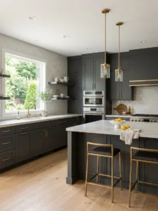
Charcoal has largely replaced pure black as the go-to choice for designers wanting a dark, moody kitchen without the starkness that full black cabinetry can sometimes bring to a space. I used a deep charcoal for a client’s full kitchen cabinetry a couple of years back, and the softness compared to true black meant the kitchen read as sophisticated and dramatic without tipping into feeling cold or severe.
The undertone of your specific charcoal matters considerably here, some lean slightly blue, others slightly green or brown, and testing samples directly in your kitchen’s actual lighting helps avoid an unexpectedly muddy or flat result once the full cabinetry is installed. I’d recommend this careful testing step specifically for charcoal more than for many lighter colors, since the undertone differences, subtle on a small paint chip, become considerably more noticeable across an entire kitchen’s worth of cabinetry.
Charcoal works beautifully paired with brass or matte black hardware, and with lighter countertops and backsplash materials that keep the overall kitchen from feeling too heavy or dark throughout. I’d suggest this balance of dark cabinetry with lighter surrounding materials specifically for kitchens with good natural light, since charcoal in a genuinely dim space can start to feel oppressive without adequate brightness elsewhere in the room to offset it.
5. Buttery Yellow
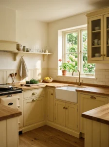
Yellow cabinetry felt like a genuinely risky recommendation just a few years ago, closely associated with dated 1970s kitchens rather than anything current, but a softer, more muted buttery yellow has recently become a color designers are increasingly willing to specify, particularly for kitchen islands or smaller accent applications. I used a muted, dusty yellow for a client’s breakfast nook cabinetry specifically, and the warmth it brought to that corner of the kitchen made it instantly feel like the coziest spot in the entire home.
The key distinction from those dated yellow kitchens of decades past is saturation and undertone, a soft, slightly muted buttery yellow reads as considerably more sophisticated than the brighter, more saturated yellows that were popular previously. I’d recommend testing your specific yellow carefully against this distinction, since a shade that’s even slightly too bright or too close to a true, saturated yellow can tip quickly into feeling dated rather than fresh.
I’d suggest this color specifically as an accent application, an island, a nook, a single wall, rather than throughout an entire kitchen’s cabinetry, since yellow’s inherent warmth and visual energy tends to work best in a more contained dose within the broader design, balanced against calmer, more neutral surrounding surfaces elsewhere in the room.
6. Warm Greige
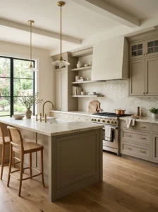
Greige, that warm middle ground between grey and beige, remains one of the most consistently recommended neutral options among designers, precisely because it manages to feel current without being tied to any single specific trend moment that might eventually feel dated. I’ve specified greige cabinetry for several clients over recent years specifically because it offers genuine longevity alongside its still-current, updated feel compared to the flatter, cooler greys that were more dominant several years earlier.
The warmth specifically distinguishes a good greige from the cooler grey cabinetry that felt ubiquitous in kitchens roughly a decade ago, and that cooler grey has genuinely started to feel dated in a way that warmer greige has, so far, largely avoided. I’d recommend testing your specific greige choice in your actual kitchen’s lighting, since undertone shifts are particularly noticeable with this color family, sometimes reading warmer or cooler than expected depending on your specific light exposure.
Greige pairs effortlessly with almost any accent color or material choice, making it an excellent foundation for anyone planning to introduce bolder colors through an island, backsplash, or hardware, while keeping the majority of their cabinetry in this versatile, enduring neutral tone that won’t need replacing as quickly as more trend-specific color choices might.
7. Deep Forest Green
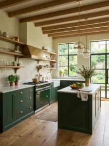
Forest green has become one of the more requested dramatic colors among clients seeking something bold but still fundamentally sophisticated and grounded, distinguishing it from brighter, more playful green tones. I specified a deep forest green for a client’s full kitchen cabinetry last year, and the richness it brought to the space, particularly paired with brass hardware and warm wood open shelving, created a genuinely striking, elegant result that felt distinctly different from more common kitchen color choices.
This shade works particularly well in kitchens with decent natural light or well-planned artificial lighting, since forest green’s depth needs adequate illumination to read as rich and sophisticated rather than simply dark and difficult to distinguish clearly. I’d recommend layering in warm-toned lighting specifically if you’re considering this color for your own kitchen, ensuring the cabinetry’s genuine richness comes through properly rather than reading as a flat, undifferentiated dark surface.
I’d suggest pairing forest green with lighter countertops and backsplash materials, similar to the balance recommended for charcoal and navy elsewhere on this list, since this contrast keeps a kitchen built around such a deep, saturated color from feeling overly heavy or enclosed, particularly important in a room where you’re spending significant time each day.
8. Soft Blush Pink
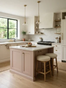
Blush has moved cautiously into kitchen cabinetry recommendations over recent years, generally in more muted, sophisticated iterations rather than anything overtly sweet or overly feminine in tone. I used a dusty, muted blush for a client’s kitchen island specifically, paired with white surrounding cabinetry, and the resulting soft pop of color felt considerably more elegant and current than a brighter, more saturated pink would have achieved in the same application.
The muted quality genuinely matters here more than with almost any other color on this list, a true, bright pink in kitchen cabinetry reads as considerably more novelty and less likely to age well, while a soft, greyed-down blush feels timeless and sophisticated in a way that avoids feeling overly themed or trend-specific to any particular decorating moment.
I’d recommend this color specifically as an island or accent application, similar to the earlier recommendation for yellow, rather than throughout a full kitchen’s cabinetry, since blush’s inherent softness works best as a considered highlight against calmer, more neutral surrounding surfaces, rather than as the dominant color throughout the entire room’s cabinetry.
9. Warm White (Not Stark White
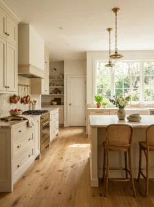
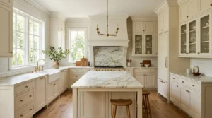
While stark, cool white cabinetry dominated kitchen design for years, designers have shifted noticeably toward warmer white options, creams and off-whites with a subtle underlying warmth, rather than the flatter, cooler whites that previously felt like the default safe choice. I switched my own recommendations to warmer whites several years ago after noticing how consistently cooler whites were starting to read as slightly dated and clinical compared to these warmer alternatives.
The distinction here is genuinely subtle but makes a real difference in how a kitchen ultimately feels, a warm white with just a hint of cream or beige undertone reads as considerably more inviting and current than a stark, cool white that can start to feel sterile, particularly in kitchens without abundant natural light to soften that coolness.
I’d recommend testing your specific white choice carefully against your kitchen’s actual countertop and flooring materials, since undertone mismatches between a cooler white and warmer surrounding materials, or vice versa, tend to be more noticeable and jarring than similar mismatches with bolder, more saturated colors that naturally draw more visual attention away from these subtler undertone differences.
10. Muted Teal
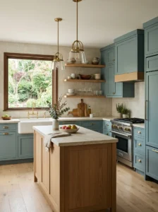
Teal occupies an interesting position between blue and green, and a softer, more muted version of this color has become an increasingly popular choice among designers looking for something distinctive without going as dark or dramatic as navy or forest green. I specified a dusty, muted teal for a client’s kitchen a couple of years ago, and its depth and sophistication surprised even her, since she’d initially been hesitant about a color she associated with brighter, more saturated versions from years past.
The word “muted” genuinely matters here, similar to several other colors on this list, a bright, saturated teal can feel closer to a specific, dated trend moment, while a softer, greyed-down version reads as considerably more current and sophisticated, closer to the color of deep ocean water than a swimming pool or a more playful, saturated teal.
I’d recommend this color paired with warm metallics, copper or brass specifically, rather than cooler chrome or stainless hardware, since the warmth helps balance teal’s inherent coolness and prevents the overall kitchen from feeling too clinical or sterile, particularly important for a color already leaning toward the cooler end of the spectrum.
11. Rich Burgundy or Wine
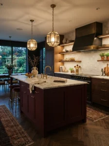
Burgundy has emerged as a genuinely unexpected but increasingly requested choice among designers working with clients who want something dramatic and distinctive that moves beyond the more commonly seen navy or forest green options. I used a deep burgundy for a client’s kitchen island specifically, paired with warm wood open shelving and brass hardware, and the resulting richness brought a genuinely luxurious, wine-cellar quality to that section of her kitchen that felt distinctly different from anything else in her home.
This color requires careful balance to avoid feeling overly heavy or dated, similar to the earlier discussion of burgundy in bedroom design, pairing it with clean-lined, more contemporary surrounding elements rather than ornate, traditional details helps the color read as current and sophisticated rather than closer to a dated Victorian aesthetic.
I’d recommend this shade specifically as an island or accent color rather than throughout a full kitchen’s cabinetry, given its intensity, and suggest testing it under your kitchen’s actual lighting conditions before committing, since burgundy can shift noticeably between looking rich and wine-like versus flat and slightly brownish depending on the specific quality and warmth of your lighting.
12. Warm Taupe
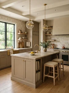
Taupe has quietly become one of the more sophisticated neutral choices designers turn to for clients wanting something with a bit more depth and character than a standard white or grey, without committing to a genuinely bold color statement. I specified a warm taupe for a client’s kitchen cabinetry last year specifically because she wanted something that felt considered and elevated without drawing too much attention away from her kitchen’s other design details, stone countertops and a striking tile backsplash.
The depth and subtle richness of a well-chosen taupe comes through particularly well against natural materials, wood, stone, woven textures, complementing rather than competing with these other elements throughout the kitchen’s broader design. I’d recommend this color specifically for kitchens where you want the cabinetry to feel intentional and sophisticated without becoming the singular focal point of the entire room’s design.
Taupe offers considerable flexibility for introducing accent colors through hardware, a backsplash, or open shelving styling, since its neutral, adaptable base works with nearly any accent choice you might introduce elsewhere, similar to the versatility discussed with greige earlier on this list, though with a slightly warmer, more grounded overall character.
13. Two-Tone Cabinetry Combinations
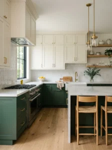
Rather than a single color throughout, two-tone cabinetry, using one color for upper cabinets and a contrasting color for lower cabinets or an island, has become one of the most consistently requested approaches among designers, offering genuine visual interest and the flexibility to introduce a bolder color in a more contained, considered dose. I’ve used this approach in several recent projects, most often pairing a deep, saturated lower cabinet color with lighter, more neutral upper cabinetry, and the resulting contrast consistently reads as more custom and considered than a single uniform color throughout.
The general principle I follow here mirrors similar guidance discussed in other design contexts, keeping the darker, more saturated color on lower cabinets and the lighter color above tends to feel more visually balanced and grounded than the reverse arrangement, though this isn’t an absolute rule and some genuinely striking kitchens do successfully flip this convention.
I’d recommend choosing two colors that share some underlying relationship, perhaps similar undertones or complementary rather than clashing tones, rather than two entirely unrelated colors chosen independently of each other, since this coordination is what separates a genuinely intentional two-tone kitchen from one that simply reads as mismatched or accidental.
14. Olive Green
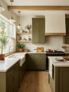
Olive has gained considerable traction recently as an alternative to the more commonly seen sage, offering a slightly deeper, earthier quality that appeals to clients wanting something with a bit more richness and depth than sage’s typically lighter, softer character. I specified olive for a client’s kitchen cabinetry within the past year, and its understated, slightly vintage quality gave her kitchen a considered, timeless feel that avoided reading as overtly trendy despite the color’s relatively recent surge in designer popularity.
What distinguishes olive from a color likely to feel dated quickly is its inherent earthiness and complexity, it reads as considered and grounded rather than as a singular, attention-grabbing statement color, which tends to give it more genuine longevity than brighter, more saturated green alternatives might offer over the coming years.
I’d recommend pairing olive with warm wood tones, brass hardware, and cream or ivory surrounding surfaces, all of which enhance its earthy, grounded character, while I’d suggest avoiding pairing it with very cool greys or stark whites, which can make the olive read as slightly murky or unclear rather than rich and intentional.
15. Soft Sky Blue
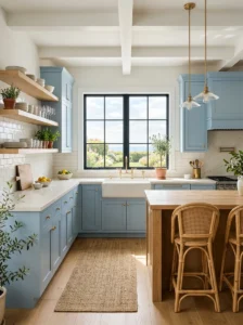
A gentle, muted sky blue has found its way into kitchen cabinetry recommendations recently, particularly for kitchens wanting a calm, coastal-adjacent feel without committing to the deeper drama of navy or teal. I used this shade for a client’s kitchen island specifically, keeping the surrounding cabinetry in a warm white, and the resulting soft, airy pop of color brought a genuinely fresh, light quality to her kitchen without feeling overly saturated or specific to a single narrow decorating theme.
The muted quality remains essential here, similar to several other lighter colors discussed throughout this list, a softer, dustier sky blue reads as considerably more sophisticated and adult than a brighter, more saturated version, which can start to feel closer to a nursery color than something appropriate for a genuinely elegant kitchen space.
I’d recommend this color specifically for kitchens with abundant natural light, since sky blue’s softness and airiness comes through most successfully in a bright, sunlit space, while a dimmer kitchen might cause this particular shade to read as somewhat flat or grey rather than genuinely fresh and inviting.
16. Deep Plum
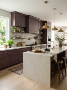
Plum has emerged as a genuine alternative to burgundy for clients wanting a rich, jewel-toned color with slightly less intensity and a touch more softness than burgundy typically offers. I specified plum for a client’s kitchen island last year, and the resulting depth felt distinctly luxurious without tipping into the heavier, more dramatic quality that a full room of burgundy cabinetry might achieve.
This color works particularly well balanced against lighter surrounding elements, similar to the general principle discussed with several other dark, saturated colors throughout this list, keeping countertops and backsplash materials in lighter, more neutral tones prevents a kitchen built around plum cabinetry from feeling overly heavy or enclosed.
I’d recommend brass or warm gold hardware specifically with plum, since the combination lifts the color and adds a touch of genuine glamour that suits plum’s inherently rich, romantic character particularly well, distinguishing this pairing from the slightly cooler, more modern feel a chrome or nickel hardware choice might bring to the same color.
17. Warm Off-White
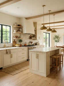
Beyond simply avoiding stark white, as discussed earlier, a genuinely warm off-white, with a noticeable, deliberate hint of cream or beige, has become a specific favorite among designers wanting something that reads as light and versatile without any of the coolness that even a moderately warm white might still carry. I’ve specified this specific warmer off-white for several kitchens recently, and clients consistently comment on how much more inviting their kitchens feel compared to the cooler, more clinical whites they’d previously considered.
The distinction from a merely “warm white,” discussed as a separate entry earlier, is largely one of degree, this off-white carries a more pronounced, immediately noticeable warmth rather than a subtle undertone that might only become apparent when compared directly against a cooler alternative.
I’d recommend this shade specifically for kitchens serving as a genuine gathering space, where you want the color to feel immediately welcoming rather than simply serving as a neutral backdrop for other design elements to stand out against. This warmer off-white also tends to photograph beautifully in a range of lighting conditions, an increasingly relevant consideration given how frequently kitchens end up documented and shared.
18. Dramatic Matte Black
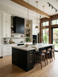
Matte black cabinetry has moved from a genuinely bold, unconventional choice a few years ago to something designers now specify with real confidence, particularly for kitchen islands or as a striking contrast against lighter surrounding cabinetry. I used matte black for a client’s kitchen island specifically, surrounded by warm white perimeter cabinetry, and the resulting contrast created an immediate, striking focal point that anchored her entire kitchen’s design.
The specific finish matters considerably here, a matte finish reads as considerably more current and sophisticated than a glossy black, which can feel closer to a specific, more dated design moment. I’d recommend matte specifically, and would suggest testing how visible fingerprints and smudges are on your specific chosen finish, since black cabinetry, matte or otherwise, tends to show this kind of daily wear more visibly than lighter colors.
I’d suggest this color specifically as an island or accent application in most kitchens, rather than throughout the full cabinetry, given how visually dominant and dramatic black reads across a larger surface area, though some genuinely striking, well-lit kitchens can successfully carry this color throughout their entire cabinetry with the right supporting design choices.
19. Coral and Peach Tones
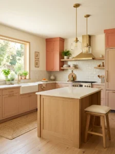
A muted, dusty coral or peach has started appearing in designer kitchen recommendations as a warmer, slightly more energetic alternative to blush, particularly appealing for clients wanting their kitchen to feel cheerful and inviting without leaning into anything overtly pastel or overly soft. I used a muted peach for a client’s breakfast nook cabinetry, and the warmth it brought to that specific corner of her kitchen made it consistently the spot where her family gathered most.
As with several other lighter, warmer colors throughout this list, the muted quality genuinely matters, a true, bright coral can feel closer to a beach house accent than a color you’d want throughout kitchen cabinetry you’re looking at daily, while a softened, dusty peach retains the warmth without quite the same intensity.
I’d recommend this color specifically paired with warm wood tones and cream surrounding surfaces, and would suggest a touch of deep green as a contrasting accent color elsewhere in the kitchen, perhaps through open shelving styling or a runner rug, which keeps the overall palette from feeling too soft or one-dimensional throughout the space.
20. Warm Chocolate Brown
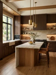
Deep, warm brown cabinetry has made a genuine, somewhat unexpected comeback in recent designer kitchens, moving well past its earlier association with dated 1990s and early 2000s kitchen design into something considerably richer and more sophisticated when executed thoughtfully. I specified a deep, warm chocolate brown for a client’s kitchen cabinetry last year, and the resulting richness, paired with brass hardware and warm stone countertops, felt genuinely elegant rather than dated in the way brown cabinetry sometimes still carries a reputation for.
The key distinction from those earlier, less successful brown kitchens comes down to undertone and finish, a warm, rich brown with genuine depth reads as considerably more current than the flatter, more orange-leaning browns that were common in earlier decades of kitchen design. I’d recommend testing your specific brown carefully against this distinction, favoring a deeper, more saturated shade over anything lighter or more orange-toned.
I’d suggest pairing this color with lighter countertops and a lighter backsplash, similar to the balance recommended for other dark, saturated colors throughout this list, ensuring the kitchen doesn’t feel overly heavy or dark despite the substantial visual weight brown cabinetry inherently carries throughout a space.
21. Soft Lavender or Dusty Purple
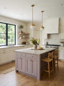
A muted, dusty lavender has begun appearing in more adventurous designer kitchens recently, typically as an island or accent color rather than throughout an entire kitchen’s cabinetry, offering a genuinely distinctive alternative to more commonly seen colors. I used a dusty, greyed-down lavender for a client’s kitchen island, and the resulting soft, sophisticated color brought a genuinely memorable, distinctive quality to her kitchen that few of her friends’ more conventionally colored kitchens could match.
As with several other softer colors discussed throughout this list, the muted, grey-leaning quality of the lavender matters enormously, a true, bright purple would feel considerably less sophisticated and more closely tied to a specific, more playful design moment than the dusty, sophisticated version I’d generally recommend for kitchen cabinetry specifically.
I’d recommend warm white or cream surrounding cabinetry paired with this lavender island, along with brushed gold accents, which together create an elegant, slightly dreamlike quality without feeling overly precious or twee, a balance that’s genuinely important given how distinctive and attention-drawing this particular color choice inherently is within a kitchen setting.
22. Warm Camel or Tan
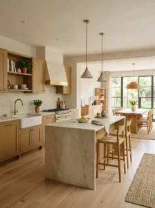
A rich, warm camel or tan has emerged as a sophisticated alternative to more standard beige or greige options, offering a bit more depth and warmth while still functioning as a genuinely versatile neutral throughout a kitchen’s design. I specified this shade for a client’s full kitchen cabinetry recently, and its warmth against her white oak flooring created a genuinely cohesive, elevated feel throughout the entire space.
This color occupies an interesting middle ground between a true neutral and a more committed color statement, offering more visual interest and warmth than a standard beige while still remaining versatile enough to pair with a wide range of accent colors and materials introduced elsewhere throughout the kitchen’s broader design.
I’d recommend this shade specifically for kitchens with warm wood flooring or furniture elsewhere in an open-concept living space, since the color’s inherent warmth creates genuine cohesion between the kitchen and adjacent living areas, an increasingly relevant consideration given how many contemporary homes feature open floor plans connecting these spaces directly.
23. Deep Emerald Green
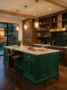
Emerald offers a more jewel-toned, glamorous alternative to the earthier forest green discussed earlier on this list, and designers have increasingly turned to this richer, more saturated green for clients wanting their kitchen to feel genuinely luxurious and distinctive. I used emerald for a client’s kitchen island specifically, paired with brass fixtures and dark wood open shelving, and the combination felt genuinely elevated in a way that surprised even the client herself, who’d initially been hesitant about committing to such a saturated color choice.
Because emerald carries such visual intensity, I’d generally recommend this shade specifically as an island or accent application rather than throughout an entire kitchen’s cabinetry, particularly in smaller kitchens where full coverage in such a saturated color might feel overwhelming rather than genuinely luxurious and considered.
Brass and gold hardware pair almost essentially with emerald, a combination that consistently reads as elegant and intentional throughout the projects I’ve worked on using this color, while dark wood surrounding elements complement the richness particularly well, distinguishing this pairing from a lighter, more Scandinavian-influenced surrounding material palette that might feel somewhat mismatched against emerald’s inherent richness.
24. Warm Butter Cream
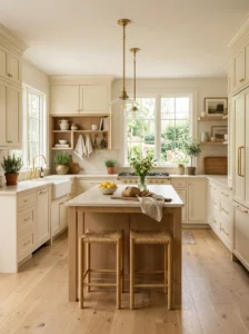
A rich, warm butter cream, distinct from both a standard warm white and the bolder buttery yellow discussed earlier, has become a favorite among designers wanting something with genuine warmth and a subtle hint of color without committing to anything overtly bold or saturated. I specified this shade for a client’s kitchen recently, and the resulting warmth felt inviting and genuinely current without drawing as much attention or requiring as much surrounding coordination as a bolder color choice might have demanded.
This shade sits comfortably between the warm white and buttery yellow entries discussed elsewhere on this list, offering just enough color to feel intentional and considered without the visual weight a fuller yellow commitment throughout an entire kitchen’s cabinetry might bring to the space.
I’d recommend this color specifically for clients wanting to move beyond a standard white without committing to anything genuinely bold, functioning as a kind of gentle first step toward more adventurous color choices for anyone hesitant about a more dramatic commitment throughout their kitchen’s primary cabinetry.
25. Custom Blended Neutrals
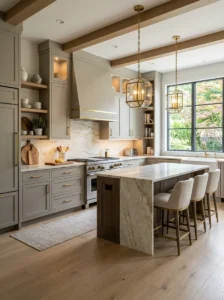
Beyond any single specific named color, an increasing number of designers are moving toward custom-mixed, uniquely blended neutral tones, colors mixed specifically for a particular client’s space rather than chosen directly from a standard paint deck, ensuring a genuinely unique result that can’t be easily replicated or immediately recognized as a specific trending shade. I worked with a paint specialist to develop a custom blended tone for a client’s kitchen last year, combining elements of warm grey and soft beige in a ratio specifically tuned to her space’s particular lighting and surrounding materials.
This approach requires more investment and expertise than simply selecting an off-the-shelf color, generally involving working directly with an experienced painter or color consultant who can properly test and adjust a custom blend specifically for your kitchen’s actual conditions, rather than relying on a pre-mixed color that was formulated without your specific space in mind.
I’d recommend this option specifically for clients with a strong, particular vision that doesn’t quite match any standard available color, or for anyone wanting genuine assurance that their kitchen’s specific color won’t become instantly recognizable as a shade from a widely circulated trend list, offering a level of genuine customization that a standard paint chip selection simply can’t provide.
Final Thoughts
Looking across every kitchen cabinet color project I’ve worked on recently, the common thread among the choices that have genuinely held up well over time isn’t a single specific color, it’s a willingness to choose something with real depth and character rather than defaulting purely to whatever feels safest. The colors designers keep returning to share a certain quality of warmth and consideration, even the boldest, most dramatic choices on this list were selected thoughtfully, tested carefully against the specific kitchen’s lighting and materials, rather than chosen purely because they were trending.
If you’re considering a cabinet color change for your own kitchen, I’d suggest starting with genuine samples tested directly in your space, rather than relying purely on how a color appears online or in someone else’s kitchen entirely, since lighting and surrounding materials affect how any given color ultimately reads far more than most people initially expect. The right color for your kitchen is ultimately the one that feels right in your own specific space, not simply whichever shade happens to be topping this particular list.