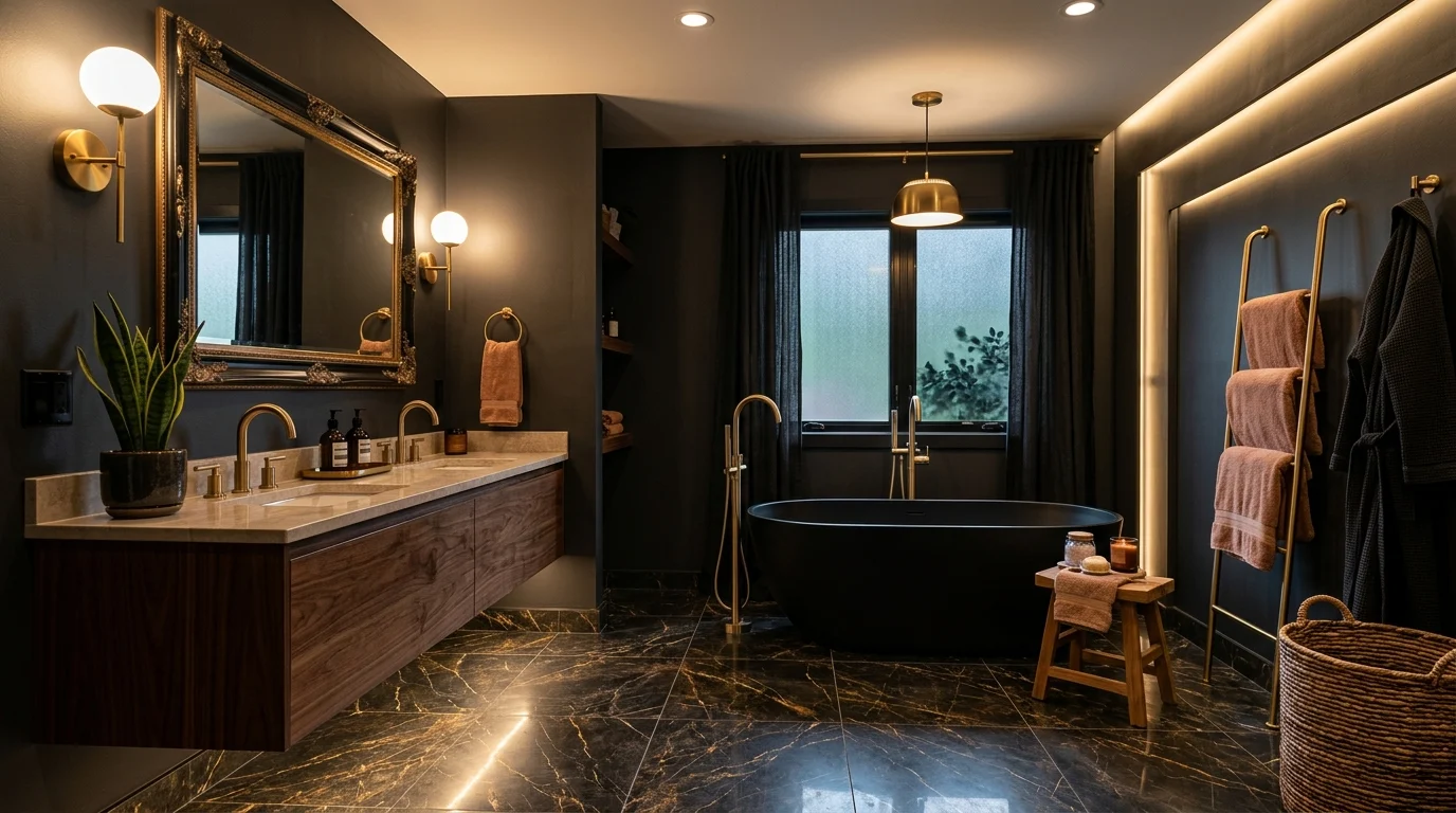
Our first attempt at a dark bathroom was, if I’m honest, a bit of a failure. We painted the walls a deep charcoal without changing anything else about the lighting or fixtures, and the room ended up feeling more like a dim, slightly gloomy afterthought than the moody, elegant space I’d pictured. It took a full redo, this time thinking properly about lighting, material contrast, and finish choices, before I actually understood what makes a dark bathroom feel luxurious rather than simply dark. The color itself was never really the problem, everything surrounding it needed to change too.
Since that redo, I’ve helped a few friends navigate their own dark bathroom projects, and picked up plenty of hard-won lessons about what genuinely works versus what only looks good in a single, carefully lit photo. Below are 17 dark bathroom ideas based on real spaces I’ve worked on, each one aimed at achieving genuine moody elegance rather than just a dim room that happens to be painted a dark color.
1. Deep Charcoal Walls with Warm Brass Fixtures
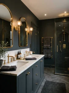
Charcoal remains one of the most reliable dark bathroom colors precisely because it reads as sophisticated rather than harsh, avoiding the starkness that full black sometimes carries while still delivering genuine drama and depth. Our own redo used a deep charcoal specifically, and the addition of warm brass fixtures, faucets, a mirror frame, cabinet hardware, was really what transformed the room from that initial gloomy failure into something genuinely elegant.
The brass warmth is doing considerably more work here than people initially expect, since cooler metal finishes, chrome, brushed nickel, tend to reinforce a dark room’s potential coldness rather than counteracting it. I’d recommend warm brass or aged bronze specifically for any dark bathroom, applying this warm metal consistently across all your fixtures rather than mixing several different tones, which reads as more intentional and elevated.
I’d suggest testing your specific charcoal shade directly in your bathroom’s actual lighting before committing to a full room, since undertones shift more noticeably in a smaller, more enclosed space like a bathroom than they might in a larger room with more varied light exposure throughout the day.
2. Matte Black Fixtures Against Light Marble
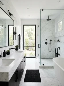
Rather than dark walls, an alternative approach to moody elegance uses matte black fixtures, faucets, a freestanding tub, hardware, set against lighter marble or stone surfaces, creating drama through contrast rather than committing the entire room to a dark color. I designed a bathroom this way for a client, keeping her walls in a soft white marble tile while introducing matte black fixtures throughout, and the resulting contrast delivered genuine sophistication without the room ever feeling dark or enclosed.
This approach works particularly well for smaller bathrooms specifically, where fully dark walls might feel overwhelming or make the space feel considerably smaller than it actually is, while black accents against light surfaces deliver moody drama without sacrificing the room’s sense of openness and light.
I’d recommend matte black specifically over a glossy black finish for fixtures, since matte reads as considerably more current and sophisticated, while also showing water spots and fingerprints less visibly than a glossy alternative would across daily use.
3. Dark Tile with Metallic Veining
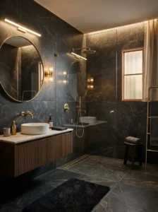
Dark tile featuring subtle metallic or lighter veining, a deep charcoal or black marble-look porcelain, brings genuine visual richness and movement to bathroom surfaces that a completely flat, uniform dark color doesn’t achieve on its own. I used a dark tile with soft gold veining for a client’s shower surround, and the way the veining caught light throughout the day added a subtle luxury that a plain, matte black tile alone wouldn’t have delivered to the same degree.
I’d recommend this specifically for larger surface areas, a full shower wall, a bathtub surround, since the veining’s visual interest is more apparent and worthwhile across a larger expanse rather than a smaller accent area where the pattern might not have enough room to genuinely read.
I’d suggest pairing veined dark tile with simple, unfussy fixtures and hardware, letting the tile’s natural pattern carry most of the room’s visual interest rather than competing with equally elaborate or decorative fixtures elsewhere in the same space.
4. A Freestanding Black Soaking Tub
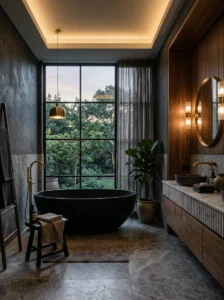
A freestanding tub finished in matte black creates an immediate, dramatic focal point in a bathroom, functioning almost like a piece of sculpture as much as a functional fixture. I specified this for a client’s primary bathroom renovation, positioning the black tub prominently in front of a window, and it became unmistakably the room’s centerpiece, anchoring the entire space’s moody, elegant character around this single striking piece.
I’d recommend positioning a black freestanding tub somewhere it can genuinely be appreciated from multiple angles, rather than tucked into a corner where its dramatic silhouette gets visually lost, since the whole point of choosing such a striking color is ensuring the tub actually gets to be seen and admired properly.
I’d suggest pairing a black tub with warm-toned surrounding materials, wood paneling, brass fixtures, warm stone flooring, ensuring the tub’s dramatic darkness feels intentional and luxurious rather than cold, an important balance given how visually dominant this single piece becomes within the room.
5. Moody Botanical Wallpaper in a Powder Room
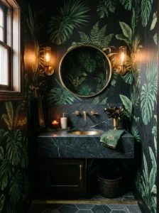
For a smaller powder room specifically, a bold, dark botanical wallpaper, deep green foliage against a black or charcoal background, delivers genuine drama and atmosphere in a space where you can commit more fully to intensity without worrying about the everyday practicality concerns of a full, frequently used bathroom. I used a wallpaper like this in a client’s guest powder room, and the immersive, jungle-like density of the pattern made this small, often overlooked room into one of the most memorable spaces in her entire home.
I’d recommend this bolder approach specifically for a powder room rather than a primary bathroom used daily for showering and getting ready, since powder rooms don’t face the same moisture and durability concerns that a full bathroom’s wallpaper would need to withstand over years of regular use.
I’d suggest a moisture-resistant, vinyl-coated wallpaper specifically even in a powder room, given the humidity fluctuations any bathroom experiences, ensuring the wallpaper holds up properly rather than beginning to peel or warp within just a year or two of installation.
6. Warm Wood Vanity Against Dark Walls
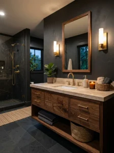
Introducing a warm wood vanity into an otherwise dark-walled bathroom brings genuine warmth and material contrast that keeps the space from feeling entirely cold or one-dimensional despite its overall dark, moody palette. I paired a rich walnut vanity with deep charcoal walls in our own bathroom’s redo, and the wood’s natural grain and warmth immediately balanced what had previously felt like an overly flat, uniformly dark space during our first, less successful attempt.
I’d recommend a warmer wood tone specifically, walnut, a rich oak, rather than a pale, cool-toned wood like whitewashed pine, since the whole point is providing genuine warming contrast against the surrounding dark walls, something a paler wood wouldn’t achieve nearly as effectively.
I’d suggest extending this wood warmth to at least one additional element beyond just the vanity, a mirror frame, open shelving, ensuring the warmth appears in more than one isolated spot throughout the room rather than feeling like a single disconnected element against an otherwise entirely dark, cool palette.
7. Dramatic Recessed Lighting with Warm Bulbs
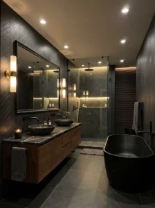
Lighting matters more in a dark bathroom than in almost any other room in the house, since a dark, moody color palette without adequate, properly planned lighting quickly tips into feeling simply dim and gloomy rather than genuinely elegant. Our first attempt at a dark bathroom failed largely because of this exact issue, relying on a single overhead fixture that had been sufficient for our previous, lighter-colored walls but proved entirely inadequate once we’d committed to charcoal.
I’d recommend layered lighting specifically for any dark bathroom, recessed ceiling lights for general illumination, combined with dedicated vanity lighting positioned at eye level for actually getting ready, and potentially an additional accent light highlighting a specific feature like a piece of art or an interesting tile detail.
I’d suggest warm white bulbs throughout, generally in the 2700K to 3000K range, since cooler lighting tends to feel even more stark and unflattering against dark walls than it would against lighter surfaces, undermining the cozy, elegant mood a dark bathroom is meant to achieve.
8. A Statement Black and Gold Mirror
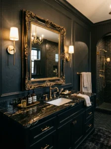
A large mirror with an ornate or substantial black and gold frame brings genuine glamour to a dark bathroom, serving as both a functional necessity and a striking decorative focal point simultaneously. I added a mirror like this to a client’s dark bathroom, positioned above her vanity, and its combination of black metal detailing with gold accents echoed the room’s other warm brass fixtures while adding a genuinely elegant, slightly vintage character to the space.
I’d recommend sizing this mirror generously relative to your vanity, since an undersized mirror can look somewhat insufficient against a larger vanity surface, while a properly scaled, substantial mirror reads as a genuine design statement rather than a purely functional afterthought.
I’d suggest coordinating this mirror’s black and gold detailing with your other fixture finishes throughout the room, ensuring the combination of these two metal tones appears consistently rather than feeling like an isolated choice specific only to the mirror itself.
9. Textured Dark Tile for Tactile Interest
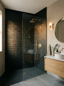
Rather than a completely flat, smooth dark tile, choosing one with genuine surface texture, a subtle ripple, a matte, slightly rough finish, adds tactile and visual interest that a perfectly smooth surface doesn’t achieve, particularly important in a dark color where texture becomes more noticeable and appreciated than it might on a lighter surface. I used a textured, matte black tile for a client’s shower wall, and the way light caught the subtle surface variation throughout the day gave the wall considerably more depth and interest than a completely flat, glossy alternative would have provided.
I’d recommend this texture specifically for larger tiled surfaces, a full shower wall or floor, where the tactile quality has genuine room to be appreciated, rather than a small accent area where the effect might be too subtle to really register.
I’d suggest pairing textured dark tile with simpler, smoother surrounding surfaces, a plain painted wall, unadorned fixtures, letting the tile’s texture stand out as a considered, deliberate choice rather than competing with equally busy or textured elements elsewhere in the same space.
10. A Dark Vanity with a Light Stone Countertop
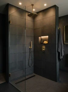
Pairing dark cabinetry with a lighter stone countertop, marble, quartz, a pale granite, creates genuine visual balance and contrast within the vanity area specifically, preventing this key functional element from feeling too heavy or monolithic despite its dark base color. I specified this combination for a client’s bathroom renovation, using deep navy cabinetry with a soft white marble countertop, and the contrast kept the vanity feeling elegant and considered rather than overly dark and imposing.
I’d recommend a stone with some subtle veining or pattern specifically, rather than a completely flat, uniform white, since the pattern adds a bit of visual interest that complements the darker cabinetry below it, creating genuine dialogue between the two materials rather than a stark, potentially jarring contrast.
I’d suggest this pairing specifically for smaller or mid-sized bathrooms, where a fully dark vanity might feel overly dominant within the room’s overall proportions, while the lighter countertop helps the piece feel appropriately scaled to the surrounding space.
11. Black Grout for Graphic Definition
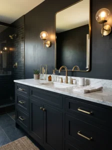
Using black grout with your tile, rather than a standard white or grey grout, creates genuine graphic definition and a more cohesive, intentional dark aesthetic throughout tiled surfaces, particularly effective when paired with darker tile colors themselves. I specified black grout for a client’s dark tile shower, and the resulting uniformity, without the visual interruption of lighter grout lines breaking up the tile pattern, gave the whole surface a considerably more seamless, sophisticated appearance.
I’d recommend this specifically when working with darker tile colors, since black grout against a lighter tile can create a strong, graphic pattern that suits some design directions but reads quite differently, and more boldly, than the seamless effect achieved when pairing black grout with equally dark tile.
I’d suggest a stain-resistant, epoxy-based grout specifically for this application, since black grout, while visually striking, can show soap scum and mineral buildup somewhat differently than lighter grout, and a higher-quality, more resistant product genuinely helps maintain that clean, seamless look over years of regular use.
12. Warm Ambient Lighting Behind the Mirror
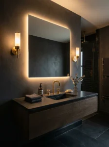
Backlit mirrors, with LED lighting installed behind the mirror’s edge rather than only on the wall beside it, create a soft, ambient glow that adds genuine atmosphere to a dark bathroom while also providing functional illumination for getting ready. I installed one of these in our own bathroom’s redo, and the soft halo of light framing the mirror’s edges adds a distinctly elegant, almost boutique-hotel quality to the room, particularly noticeable in the evening.
I’d recommend warm white LEDs specifically for this backlit effect, consistent with lighting guidance offered elsewhere throughout this list, since the whole point is contributing to a cozy, elegant atmosphere rather than a stark, clinical one.
I’d suggest this backlit mirror specifically as a complement to, rather than a replacement for, more traditional vanity lighting positioned at eye level on either side of the mirror, since the backlit glow alone typically isn’t bright or well-positioned enough to handle detailed tasks like applying makeup accurately.
13. Dark Cabinetry with Brass Cage Pulls
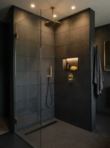
Cage-style brass drawer and cabinet pulls, with their open, slightly industrial silhouette, bring a distinctive character to dark bathroom cabinetry that standard bar or knob hardware doesn’t quite achieve. I used these on a client’s dark navy vanity, and the pulls’ open, airy design against the solid, dark cabinet fronts created a nice visual balance, adding detail and interest without feeling overly heavy or ornate.
I’d recommend this hardware style specifically for bathrooms leaning toward a slightly more industrial or eclectic overall aesthetic, rather than a more purely traditional or minimalist design direction, since the cage pull’s distinctive silhouette carries a bit more visual personality than a simpler, more understated hardware choice.
I’d suggest consistent hardware sizing across all your cabinetry specifically, larger pulls on larger drawers, proportionally smaller ones on narrower drawers, ensuring the hardware feels properly scaled and considered relative to each specific piece of cabinetry throughout the vanity.
14. A Dark Ceiling for Full Immersion
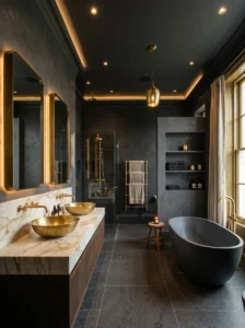
Extending your dark color choice to the ceiling itself, rather than leaving it the standard white most bathrooms default to, creates a genuinely enveloping, immersive quality that a dark-walled room with a plain white ceiling doesn’t fully achieve. I painted our own bathroom’s ceiling in the same charcoal as our walls during the redo, and the resulting fully enclosed, cocoon-like feeling made the room feel considerably more intentional and cohesive than when the ceiling remained white against our dark walls.
I’d recommend adequate lighting specifically when extending dark color to the ceiling, since a dark ceiling absorbs considerably more light than white, and a room that previously had sufficient lighting for a white ceiling may suddenly feel dim once that ceiling shifts to a darker tone.
I’d suggest this approach specifically for bathrooms with decent ceiling height, similar to guidance offered regarding dark ceilings in bedroom contexts elsewhere, since a dark ceiling in an already low-ceilinged bathroom can occasionally feel a bit heavy or oppressive rather than genuinely luxurious and immersive.
15. Warm Terracotta Accents Against Charcoal
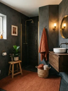
Introducing warm terracotta through towels, a bath mat, or a piece of art brings genuine earthy warmth to a charcoal or black bathroom, offering a bolder, more distinctive accent than the more commonly paired brass or gold metallics alone. I used this combination in a client’s guest bathroom, keeping the walls in deep charcoal while introducing terracotta through towels and a woven basket, and the resulting pop of warm color kept the room from feeling overly cool or monochromatic despite its otherwise entirely dark, neutral palette.
I’d recommend introducing this accent color through easily changed textiles specifically, rather than anything more permanent, letting you experiment with the combination and adjust or refresh it over time without needing to reconsider any major fixtures or tile choices.
I’d suggest pairing this terracotta accent with natural materials, a woven basket, a wood stool, reinforcing the earthy, grounded quality that terracotta brings, rather than pairing it with anything too sleek or overly polished, which would feel somewhat mismatched against terracotta’s inherently organic, warm character.
16. A Dark Bathroom with a Statement Chandelier
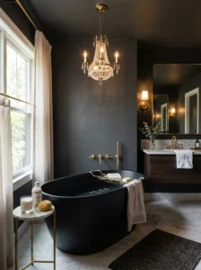
A small, elegant chandelier, even in a modestly sized bathroom, brings a genuinely unexpected touch of glamour that few people consider incorporating into this particular room. I added a small crystal chandelier to a client’s primary bathroom, positioned above her freestanding tub, and the unexpected luxury of this detail made the entire dark, moody room feel considerably more elevated and special than standard recessed lighting alone would have achieved.
I’d recommend a fixture scaled appropriately to your bathroom’s specific dimensions, since bathrooms are generally more modestly sized than a living room or bedroom, and an appropriately smaller chandelier reads as elegant and considered rather than disproportionate or overwhelming for the space.
I’d suggest ensuring any chandelier or hanging fixture is rated specifically for damp or wet locations if positioned near your shower or tub, an important safety consideration that a standard, non-rated fixture wouldn’t meet, regardless of how visually appropriate it might otherwise seem for the space.
17. Deep Green as an Alternative Dark Palette
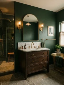
For anyone wanting genuine darkness and moodiness without committing to pure black, charcoal, or navy, a deep forest or emerald green offers an alternative dark palette with its own distinct, sophisticated character. I used a deep emerald for a client’s powder room specifically, paired with brass fixtures and a marble countertop, and the resulting richness felt genuinely luxurious and distinctive compared to the more commonly seen dark bathroom color choices.
I’d recommend this shade specifically for bathrooms with decent lighting, either strong natural light or well-planned artificial lighting, since green’s depth, similar to guidance offered regarding this color in other room contexts, needs adequate illumination to read as rich and sophisticated rather than simply dark and difficult to distinguish clearly.
I’d suggest pairing deep green specifically with warm brass or gold fixtures and a lighter stone countertop, creating the same kind of grounding contrast discussed throughout several other ideas on this list, ensuring the room feels balanced and elegant rather than uniformly heavy from floor to ceiling.
Final Thoughts
Looking back at both our failed first attempt and the considerably more successful redo of our own dark bathroom, the difference ultimately came down to treating the dark color as one part of a fuller design plan, not the entire plan itself. Lighting, material contrast, and warm metal accents are what actually turn a dark bathroom from simply dim into genuinely moody and elegant, and skipping any of these supporting elements is almost always what causes a dark bathroom project to fall short of that intended feeling.
If you’re considering a dark bathroom for your own home, I’d suggest planning your lighting and metal finishes with just as much care as you put into choosing the actual wall or tile color, since these supporting details are genuinely what separate a bathroom that feels like a luxurious retreat from one that simply feels a little too dark for comfort.