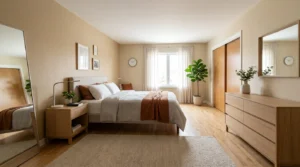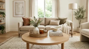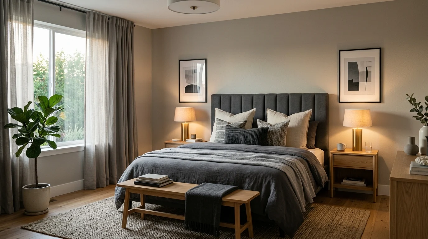
When I first painted my bedroom grey, my sister walked in, looked around, and said, “Are you sure you don’t want to add some color?” I get why she said that. Grey has this reputation for being the safe, boring choice, the color people pick when they can’t decide on anything else. But three years later, that same bedroom is still my favorite room in the house, and my sister has since painted her own bedroom a shade of charcoal grey too.
The truth is, grey is one of the most flexible colors you can use in a bedroom. It changes personality depending on what you pair it with. Cold and moody with black metal accents. Warm and inviting with wood tones and cream linen. Playful with a splash of mustard or blush pink thrown in. I’ve spent a lot of time (and a few paint samples I regret buying) figuring out what actually works, and I’m sharing everything I learned below, along with the mistakes so you don’t have to repeat them.
Here are 24 grey bedroom ideas that prove this color is anything but boring.
1. Layer Different Shades of Grey Together
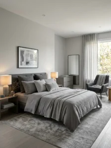
One mistake I made early on was assuming grey is just grey. It isn’t. There’s cool grey with blue undertones, warm greige that leans beige, and deep charcoal that almost reads as black in low light. When I redid my own room, I used three different shades in the same space: a light dove grey on the walls, a mid-tone grey linen duvet, and a charcoal accent chair in the corner. The layering is what stopped the room from feeling flat.
If you’re planning this yourself, get actual paint swatches and tape them to your wall for a few days. Look at them in the morning, at noon, and at night, because grey shifts dramatically under different lighting. What looked like a soft dove grey in the store looked almost lavender in my bedroom under evening lamp light, which was not what I expected at all.
A good rule I now follow: pick one dominant grey for the largest surface, usually the wall, then choose a slightly darker and slightly lighter shade for your textiles and furniture. This creates depth without needing a single extra color in the room. It’s a simple trick, but it’s the difference between a grey room that feels intentional and one that feels like you just ran out of paint ideas halfway through.
2. Add Warmth With Natural Wood Furniture
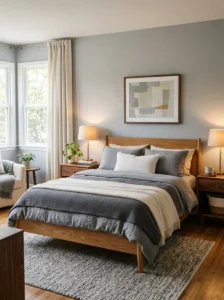
Grey walls next to a cold metal bed frame can feel like a hospital room if you’re not careful, which is something I learned the hard way in my first apartment. The fix was swapping my metal frame for a simple oak bed, and it changed the entire feel of the room within a day.
Wood does something grey alone can’t. It brings warmth and texture into a color scheme that can otherwise feel sterile. You don’t need an expensive set either. A secondhand wooden nightstand, refinished with a light sanding and a coat of natural oil, works just as well as something bought new. I found mine at a local secondhand shop for less than what a single new lamp would have cost.
Try to keep the wood tones consistent if you can, though it’s not a hard rule. My nightstands are a warm honey oak and my headboard is a slightly darker walnut, and the small contrast actually works in the room’s favor rather than clashing. What matters more is that the wood grain is visible and not painted over, since that visible texture is what balances out the flatness of the grey paint.
3. Bring In Texture Through Textiles
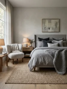
If your grey bedroom feels flat, texture is usually the missing piece, not color. I didn’t understand this until I added a chunky knit throw to the end of my bed and suddenly the whole room felt finished, even though nothing else had changed.
Grey is a color that thrives on texture because it doesn’t compete with pattern or fight for attention the way bright colors do. Try mixing a linen duvet cover with a bouclé accent chair, a woven jute rug, and a velvet throw pillow or two. Each material catches light differently, and that variation is what gives a monochrome room its visual interest.
I’d recommend starting with your bedding since it covers the most surface area. A linen or waffle-weave duvet in a slightly different grey than your walls adds subtle dimension without any real effort. From there, layer in a rug with visible texture, like a chunky wool or a natural fiber weave, and finish with two or three textured throw pillows. Avoid making everything the exact same shade of grey, because that flattens the texture instead of highlighting it. Small tonal differences are what make the fabric details actually noticeable.
4. Use a Deep Charcoal Accent Wall
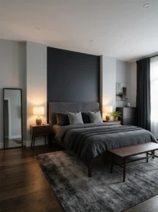
I was nervous about doing a dark accent wall for almost a year before I finally committed to it, mostly because I was worried the room would feel smaller. It did the opposite. A single charcoal wall behind my headboard actually made the room feel more intentional and gave the bed a sense of importance it didn’t have with four matching light grey walls.
The trick that made it work was keeping the other three walls a much lighter grey or even off-white. That contrast is what prevents the room from feeling like a cave. I also added a simple black-framed mirror on the opposite wall to bounce some light back across the dark surface, which made a noticeable difference in how bright the room felt in the evening.
If you’re hesitant, start small. Paint just the wall behind your bed rather than committing to the whole room. You can always expand later if you like the effect, but going the other direction, painting over a dark wall you regret, takes a lot more time and primer than most people expect. I speak from experience on a different wall in my house that took three coats to undo.
5. Mix In Black Metal Accents
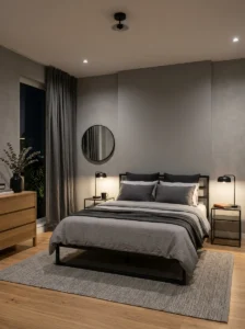
Black hardware and fixtures against grey walls create a look that feels current without trying too hard. I swapped my brass cabinet handles for matte black ones on a random Sunday afternoon, and it’s one of the cheapest updates I’ve made that had the biggest visual payoff.
Think beyond just handles though. A black metal bed frame, black-framed windows or mirrors, black candle holders, even a black desk lamp, all of these small touches tie a grey room together in a way that feels cohesive rather than accidental. The key is repetition. One black accent can look random, but three or four scattered around the room reads as a deliberate design choice.
I’d also suggest not going overboard with shiny black finishes, since they can feel a bit harsh against soft grey textiles. Matte black tends to blend better and photographs less “cold” than glossy black hardware. When I switched my closet door handles from glossy to matte, the difference was subtle in person but noticeable in every photo I took of the room afterward.
6. Try a Soft Greige for a Cozier Feel
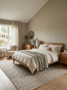
If pure grey feels too cold for your taste, greige, that in-between shade of grey and beige, might be exactly what you’re looking for. I recommended this to a friend who wanted a grey bedroom but kept saying the paint samples felt “unfriendly,” and greige solved that problem for her almost immediately.
Greige works particularly well in bedrooms that don’t get a lot of natural light, since pure cool grey can feel gloomy in a north-facing room. The beige undertone adds just enough warmth to keep the space feeling inviting rather than clinical. Pair it with warm wood furniture and cream linens, and you get a bedroom that reads as calm and grounded rather than cold.
One thing to watch for: greige paint can look different depending on the lighting in your specific room, more than almost any other neutral. I’d genuinely recommend testing a large swatch, not the small paint chip cards, directly on your wall before committing to a full gallon. What looks perfectly balanced in a showroom can shift toward pink or green undertones once it’s on your actual walls under your actual lighting.
7. Add a Statement Headboard
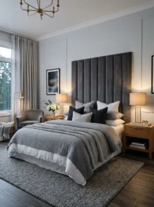
A plain grey room can feel unfinished without a strong focal point, and the easiest way to fix that is with a statement headboard. Mine is an upholstered, channel-tufted design in a deep charcoal velvet, and it’s the first thing anyone notices when they walk into the room.
You don’t need to spend a fortune here either. I’ve seen people achieve the same effect with a large framed piece of fabric mounted behind the bed, or even a bold wallpaper panel cut to headboard size and hung on the wall. The goal is simply to give the eye somewhere to land, since an all-grey room without a focal point can start to feel like one big blur.
If you’re working with furniture you already own, consider reupholstering an existing headboard rather than buying new. I had mine redone by a local upholsterer for less than half the cost of a comparable new piece, and I got to choose the exact fabric and tufting pattern I wanted instead of settling for whatever was available in stores.
8. Bring Nature Indoors With Plants
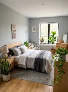
Grey rooms can occasionally feel a little lifeless, and the fastest fix I’ve found is adding real plants. A snake plant in the corner and a trailing pothos on my dresser did more to make my bedroom feel alive than any decor purchase I made that year.
The green against grey creates a natural contrast that photographs beautifully and, more importantly, actually feels good to wake up to every morning. Low-light bedroom plants like snake plants, ZZ plants, and pothos are forgiving for people who don’t have a great track record with keeping things alive, myself included.
If you’re worried about maintenance, start with just one plant rather than filling every surface at once. I killed two plants before I found a watering routine that actually worked for my space, and there’s no shame in that learning curve. Once you find what thrives in your specific light conditions, it becomes much easier to add more without overwhelming yourself or the room.
9. Use Grey and White for a Scandinavian Look
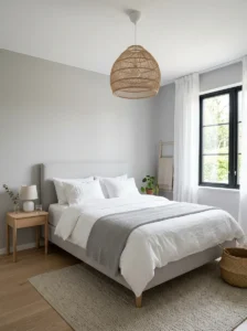
If you love the idea of a minimalist, airy bedroom, pairing grey with crisp white is a combination that rarely goes wrong. I did this in a guest room and it consistently gets compliments from visitors who stay over, more than any other room in the house.
The key to this look is keeping things simple. White walls, a light grey upholstered bed frame, white bedding with maybe one grey throw pillow, and minimal clutter on every surface. Scandinavian design leans heavily on the idea that a room needs breathing space, so resist the urge to fill every corner with decor.
Add warmth back into the mix with a light wood nightstand or a woven rattan pendant light, since an all-white-and-grey room without any wood tones can feel a little sterile. I learned this after leaving my guest room completely wood-free for months, and adding a single rattan lamp shade made the entire space feel noticeably more finished and lived-in.
10. Incorporate Blush Pink Accents
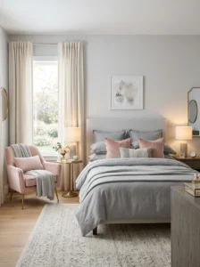
Grey and blush pink is a combination I was skeptical about until I saw it in person at a friend’s apartment. It’s soft, a little romantic, and works surprisingly well without feeling overly feminine or fussy, even in a fairly neutral space.
A few blush throw pillows, a pink velvet accent chair, or even just fresh flowers in a vase can introduce this color without requiring any repainting. I added a single blush pink lumbar pillow to my otherwise grey and white bedding, and it’s a small change that gets noticed every single time someone new visits my room.
If you want to go further, a soft pink area rug or a set of curtains in a muted rose tone can extend the color scheme without overwhelming the space. The trick is to treat pink as an accent, not a competing main color. Grey should still dominate the room visually, with the pink acting as a warm, gentle contrast rather than a second focal point fighting for attention.
11. Choose Grey Wallpaper With Subtle Pattern
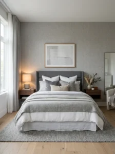
Solid grey paint is lovely, but wallpaper with a subtle pattern, think fine stripes, a soft geometric print, or a textured grasscloth look, can add dimension that flat paint simply can’t achieve. I used a subtly textured grey wallpaper on one wall of my bedroom, and it reads as almost architectural in certain lighting.
The advantage of pattern over a plain accent wall is that it adds visual interest without introducing a new color into the room. This keeps the overall palette calm while still giving the eye something more detailed to look at up close. I chose a wallpaper with a slightly raised texture, almost like linen, which also helps with sound absorption in a way flat paint never could.
If you’re nervous about committing to wallpaper, peel-and-stick versions have improved enormously in recent years and are genuinely renter-friendly. I tested one on a smaller wall in my hallway before committing to a full bedroom wall, and it gave me the confidence to know exactly how the pattern would actually look in my specific lighting before spending more on the real thing.
12. Layer Rugs for a Grounded Look
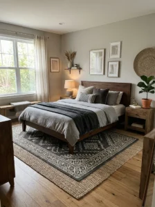
One rug rarely does enough work in a bedroom, especially a grey one where texture needs to carry more of the visual weight. I started layering a smaller patterned rug over a larger neutral jute rug under my bed, and the difference in how grounded the room felt was immediate.
The larger base rug adds warmth underfoot and softens the hard flooring, while the smaller layered rug on top introduces pattern or a slightly different grey tone without needing to change your paint or furniture. This layered approach also works well if you’re renting and can’t commit to permanent flooring changes but still want the room to feel intentional.
When choosing rugs for a grey bedroom, look for natural fibers like jute or wool for the base layer, since they photograph well against grey walls and add genuine texture you can feel underfoot. For the top layer, a rug with a subtle geometric pattern in charcoal and cream ties the whole floor composition together without clashing with anything else in the room.
13. Add Warm Ambient Lighting
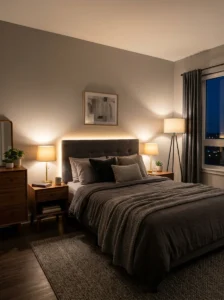
Grey rooms lit only by harsh overhead lighting can feel cold no matter how well you’ve decorated everything else. This was a mistake I made for almost a year before I finally invested in proper bedside lamps with warm bulbs, and it transformed how the entire room felt every evening.
Layered lighting matters more in a grey bedroom than almost any other color scheme, because grey reflects and absorbs light differently depending on the source. A single overhead fixture creates flat, even lighting that can make grey walls look almost institutional. Adding table lamps, a floor lamp, and maybe some subtle LED strip lighting behind the headboard creates pools of warm light that make the room feel cozy instead of clinical.
I’d recommend sticking to warm white bulbs, generally around 2700K, rather than cool white or daylight bulbs in a grey bedroom. Cool lighting tends to emphasize the blue undertones in grey paint, making the room feel colder than intended, while warm lighting softens those same undertones and makes the space feel far more inviting in the evening hours.
14. Use Grey Curtains for a Cohesive Look
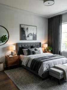
Matching your curtains to your wall color, or choosing a slightly different shade of grey, creates a seamless, cohesive look that makes a bedroom feel intentionally designed rather than pieced together over time. I switched from white curtains to a heavier charcoal grey linen, and the room instantly felt more grounded and complete.
Heavier curtains also have a practical benefit beyond aesthetics. They block more light and provide better sound insulation than lighter fabrics, which matters if your bedroom faces a street or gets early morning sun that wakes you up too soon. My previous white curtains let in enough light by six in the morning to wake me every single day, and the heavier grey fabric fixed that problem within the first week.
If you want your window to feel taller and your ceiling to feel higher, hang your curtain rod a few inches above the actual window frame and let the curtains fall all the way to the floor. This trick works in any color scheme, but it’s particularly effective with grey, since darker curtains that pool slightly at the floor add a sense of luxury and intentional design to the room.
15. Combine Grey With Navy Blu
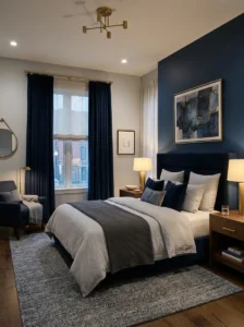
Grey and navy is a combination that feels sophisticated without trying too hard, and it’s one I turned to when I wanted my bedroom to feel a bit more masculine and grounded. A navy accent wall paired with light grey bedding creates a rich contrast that photographs beautifully in almost any lighting.
This pairing works because both colors sit on the cooler end of the color wheel, so they naturally harmonize rather than clash. I used navy for my curtains and one accent wall, keeping the rest of the room in lighter greys, which prevented the space from feeling too dark or heavy overall.
Brass or gold hardware pairs surprisingly well with this combination if you want a touch of warmth against the cool tones. I added brass drawer pulls to my grey dresser in a navy-accented room, and the small gold detail keeps the whole space from feeling too monochromatic or flat, giving it just enough visual interest to catch the eye.
16. Add a Gallery Wall in Black Frames
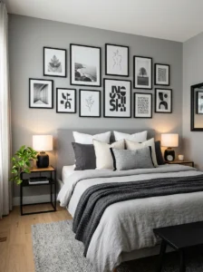
A blank grey wall can start to feel a little empty after a while, and one of the easiest fixes is a gallery wall using black picture frames. I put together mine over the course of about two months, adding pieces slowly rather than all at once, which actually made the final result feel more personal and less staged.
Black frames against grey walls create a clean, graphic contrast that doesn’t compete with the color scheme the way brightly colored art might. Mix photographs, simple line drawings, and a few typography prints for variety, but try to keep the frame color consistent so the wall reads as one cohesive collection rather than a random assortment.
I’d suggest laying your frames out on the floor first before hanging anything, moving them around until the spacing feels balanced. This saved me from an embarrassing number of extra nail holes in my wall. Leave roughly two to three inches between each frame for a gallery wall that feels intentional rather than cramped or randomly assembled.
17. Use Grey Built-In Shelving
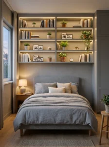
If your bedroom doubles as a reading nook or a small hom
e office corner, built-in shelving painted the same grey as your walls creates a seamless, custom look without the room feeling cluttered. I had a carpenter build simple floating shelves in my bedroom corner, painted to match the wall exactly, and it looks like it was always part of the room’s original design.
Matching the shelf color to your wall color is the key detail here. It makes the shelving recede visually, putting the focus on whatever books or objects you display rather than on the furniture itself. This is especially useful in smaller bedrooms where you want storage without adding visual bulk to the room.
If built-ins aren’t in your budget, floating shelves from a hardware store, painted or wrapped in a matching grey finish, achieve a similar effect for a fraction of the cost. I did exactly this in a smaller bedroom before I could afford custom carpentry, and most people who saw the room assumed the shelves were built in from the start.
18. Try a Moody All-Grey Palette
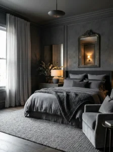
Sometimes the boldest choice is to commit fully to grey, using multiple shades throughout the entire room rather than breaking it up with other colors. I did this in a guest bedroom, using charcoal on the walls, mid-grey bedding, and light grey curtains, and the result feels genuinely dramatic in a way I didn’t expect from a single-color scheme.
The trick to making an all-grey room work is varying the finish and texture as much as possible. Matte walls, a slightly glossy headboard, a chunky knit throw, and a smooth leather accent chair all reflect light differently even in the same color, which keeps the eye engaged instead of finding the room monotonous or flat.
Good lighting becomes non-negotiable in this kind of room. Without warm lamps and some natural light during the day, an all-grey palette can tip into feeling gloomy rather than moody in the good sense. I learned to keep at least one large mirror in the room to bounce light around, which noticeably lifted the overall mood of the space.
19. Add a Woven Rattan Accent
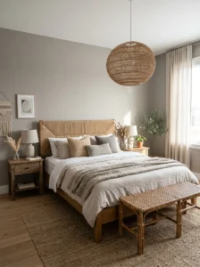
Rattan and grey might seem like an unlikely pairing, but the natural texture of woven rattan softens what could otherwise be a fairly hard, cool color scheme. I added a rattan pendant light and a small rattan bench at the foot of my bed, and both instantly warmed up the room without adding any actual color.
This combination works particularly well if your grey bedroom is leaning a bit too cold or modern for your taste. The organic, handmade quality of rattan introduces a relaxed, almost coastal feel that contrasts nicely with grey’s more structured, contemporary reputation. It’s an easy way to soften a room without abandoning your color scheme entirely.
Look for rattan mirrors, pendant lights, or small accent furniture pieces at secondhand shops if you’re on a budget, since rattan has been a popular material for decades and secondhand pieces are often available for a fraction of retail price. My rattan bench came from a garage sale and just needed a light cleaning before it fit perfectly into the room.
20. Use Grey for a Small Bedroom to Make It Feel Bigger
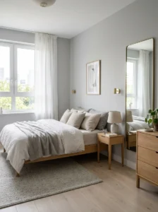
There’s a common myth that dark colors always make small rooms feel smaller, but I’ve found the opposite is often true with the right shade of grey. A soft, light grey on the walls in my small guest bedroom actually made the space feel more open and cohesive than the previous stark white did.
The key is choosing a grey with enough light reflectance value, generally something in the lighter to mid-range rather than a deep charcoal, if your primary goal is to visually expand the room. Pairing that lighter grey with a large mirror opposite the window bounces natural light around the space and reinforces the sense of openness.
Keep furniture on the lower side and choose pieces with visible legs rather than furniture that sits flush against the floor, since this creates a sense of visual space beneath each piece. I swapped a solid-based dresser for one on slim wooden legs in my smallest bedroom, and the floor visibility alone made the whole room feel noticeably larger.
21. Add Metallic Accents in Gold or Brass
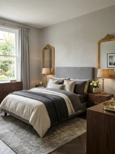
Grey provides such a neutral backdrop that metallic accents in gold or brass genuinely shine against it, quite literally. I added a brass floor lamp and a few small gold-rimmed frames to my otherwise all-grey bedroom, and the warm metallic tones keep the space from feeling too monochromatic or cold.
Unlike black metal accents, which lean more modern and graphic, gold and brass introduce a softer, slightly more glamorous feel to a grey room. This combination works particularly well if you want your bedroom to feel a bit more elevated or elegant rather than strictly minimalist or industrial in its overall styling.
Start small if you’re testing this look, since too much brass at once can feel overwhelming rather than luxurious. I began with just a single brass table lamp before adding drawer pulls and a mirror frame over the following months, which let me gauge how much metallic warmth actually suited the room before fully committing to the look.
22. Choose Grey Bedding With Interesting Texture

Your bedding takes up more visual real estate than almost anything else in the room, which means the texture you choose matters enormously in a grey bedroom. I switched from a smooth cotton duvet to a waffle-weave version in a similar grey tone, and the subtle texture alone made the bed look far more expensive than it actually was.
Look beyond just color when shopping for bedding and pay attention to weave and fabric type. Linen has a relaxed, slightly rumpled look that suits a more casual grey bedroom, while a smoother sateen finish leans more polished and formal. Waffle-weave and matelassé both add visible texture that photographs beautifully against flat painted walls.
I’d also recommend mixing at least two different grey tones within your bedding itself, rather than a single flat shade across the sheets, duvet, and pillows. My current setup uses a lighter grey fitted sheet with a slightly darker charcoal duvet cover, and that small tonal shift creates depth in a bed that would otherwise photograph as one flat block of color.
23. Add a Bold Piece of Art as a Focal Point
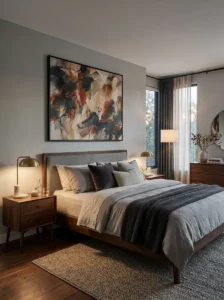
Even the most beautifully layered grey bedroom can feel like it’s missing something without a genuine focal point, and a bold piece of art is often the easiest way to solve that. I hung a large abstract painting with hints of rust orange over my bed, and it immediately became the centerpiece of the entire room.
The trick is choosing artwork with enough color or contrast that it stands out clearly against your neutral walls, rather than something that blends in and disappears. A grey and white abstract piece might look elegant on its own, but it can get lost against grey walls, while a piece with warm tones or a pop of color draws the eye exactly where you want it.
Scale matters just as much as color here. A small piece of art on a large wall tends to look like an afterthought, so I’d recommend sizing your artwork to cover roughly two-thirds the width of your headboard for the most balanced, intentional-looking result above your bed.
24. Keep Accessories Minimal but Meaningful
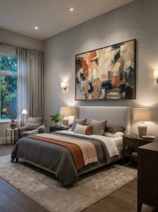
After trying almost every trend on this list at some point, the lesson I keep coming back to is that a grey bedroom looks its best when the accessories are chosen carefully rather than piled on all at once. My nightstand holds exactly three things: a lamp, a small stack of books, and a single framed photo, and that restraint is part of what makes the room feel calm.
Grey is a quiet color, and it works best when the objects around it are given room to breathe rather than competing for attention. Instead of filling every shelf and surface, choose a handful of pieces that genuinely mean something to you, whether that’s a travel souvenir, a plant you’ve kept alive for years, or a candle in a scent you actually love.
This approach also makes the room easier to update over time. When you keep your base accessories minimal, swapping in a new throw pillow or a seasonal candle refreshes the whole space without requiring you to redecorate from scratch every time your taste shifts slightly, which is exactly how my own bedroom has evolved over the past three years.
Final Thoughts
Grey gets dismissed as the boring, safe choice more often than it deserves. In reality, it’s one of the most adaptable colors for a bedroom, quiet enough to let texture, wood tones, and small color accents do the talking, but structured enough to feel calm and put together every single time you walk into the room. My own grey bedroom has changed in small ways over the past three years, a new throw here, a different lamp there, and it has never once felt boring to me.
If you’re on the fence about painting your bedroom grey, start small. Try one accent wall, one textured throw, or one statement piece of furniture before committing to a full room overhaul. You’ll get a much clearer sense of which direction, cool and moody or warm and cozy, actually feels right for your space before you invest in the rest.