I painted my first set of kitchen cabinets on a whim during a long weekend, mostly because I was tired of staring at the same tired oak finish that came with the house and couldn’t afford a full renovation. What started as a quick weekend project turned into an obsession — I’ve now repainted cabinets in three different kitchens across two homes, made every mistake possible along the way, and learned exactly which colors and techniques actually hold up to daily cooking, spills, and constant hand contact. Here are 21 ideas I’ve tried myself, seen work beautifully for friends, or picked up from professional painters who know far more about durable finishes than I ever did starting out.
1. Two-Tone Cabinets
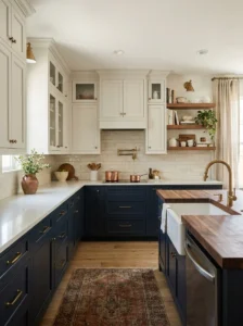
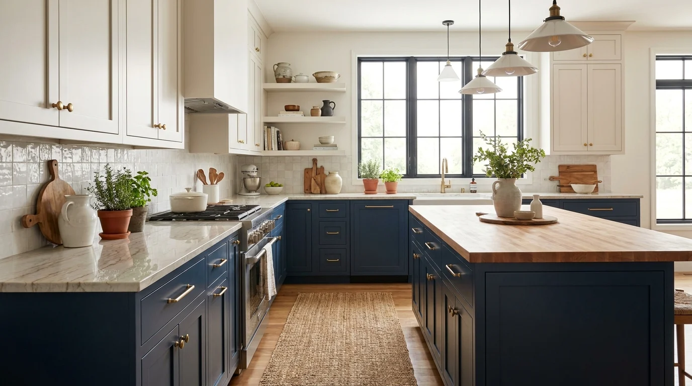
Two-tone cabinets were the very first thing I tried, mostly out of indecision more than anything else — I genuinely couldn’t choose between a bold color and something safer, so I did both. Uppers in a soft white, lowers in a deep navy, and the contrast ended up being the single best decision I made in that entire kitchen.
The general rule I’ve settled on after doing this a few times is to keep the lighter color up top, since it helps the ceiling and upper portion of the room feel taller and airier, while the bolder color grounds the space down below, closer to the floor where visual weight naturally belongs.
I’d recommend testing your color combination on large poster boards taped to the actual cabinets before committing, rather than relying on paint chips alone, since the way two colors interact together looks completely different once you see them at full cabinet scale under your kitchen’s specific lighting.
This approach also solves a very practical budget problem, since you can paint just the lower cabinets in a bold, dramatic color while leaving the uppers in a simpler, cheaper white, giving you most of the visual drama for a fraction of the paint and labor a fully colored kitchen would require.
2. Sage Green
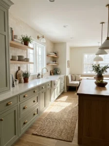
Sage green has become almost impossible to avoid in kitchen design over the last couple of years, and I’ll admit I was skeptical it would still look good once the trend faded, but after living with mine for over a year now, I genuinely think it’s one of the more timeless choices on this entire list.
I chose a slightly muted, grayed-down sage rather than a brighter, more saturated green, specifically because the softer tone reads as calming and a little vintage rather than trendy in a way that might feel dated in a few years, which was my biggest worry going into this project.
Pairing sage green with brass or unlacquered brass hardware has become my favorite combination, since the warm metal tone plays beautifully off the cool undertone in the green paint, creating a balanced look that feels collected rather than overly matched or coordinated to a single color story.
This color works particularly well in kitchens with lots of natural light, since sage can occasionally read a bit murky or flat in darker spaces without enough sun exposure. If your kitchen leans dark already, I’d test a sample swatch at different times of day before fully committing to this specific shade.
3. Navy Blue Lower Cabinets
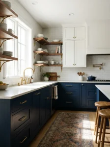
Navy blue lower cabinets paired with a lighter upper cabinet or open shelving has become one of the most requested looks I hear about from friends renovating their own kitchens, and after living with mine for going on three years now, I understand exactly why it’s stuck around as a genuine classic rather than a passing trend.
I went with a deep, almost black-navy for my lower cabinets specifically because it hides daily wear and tear remarkably well — fingerprints, minor scuffs, the general grime of a kitchen in constant use — far better than a lighter color ever could in that same high-touch, high-traffic zone.
The depth of navy also makes it incredibly versatile alongside other design choices. I’ve paired mine with warm wood open shelving, brass fixtures, and white marble-look countertops, and the navy manages to feel sophisticated against all three without clashing or competing for attention in the space.
If you’re nervous about committing to a bold color across an entire kitchen, navy lower cabinets paired with simple white uppers is one of the lowest-risk ways to introduce real drama and depth into the room while still keeping things feeling fresh, bright, and not overly heavy or dark overall.
4. Classic White Refresh
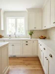
Sometimes the best update isn’t a bold new color at all, just a genuinely fresh coat of white paint, and this was exactly the case in my mother’s kitchen, where decades of cooking had left her original white cabinets yellowed and dingy despite being a perfectly good style and layout underneath it all.
I helped her repaint using a proper cabinet-grade paint rather than standard wall paint, and the difference between her old, yellowed finish and the crisp new white was honestly more dramatic than I expected from something as simple as “the same color, just newer.”
Choosing the right white matters more than people assume going into this. We tested several samples before landing on a warm white with subtle cream undertones rather than a stark, cool white, since the warmer tone felt more inviting and paired better with her existing wood floors and countertops.
This is genuinely one of the most budget-friendly options on this entire list, especially if your current cabinets are already white or a similar light color, since you’re not fighting against a darker existing finish and can often achieve full coverage with fewer coats of paint overall.
5. Black Cabinets for Dram
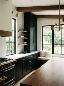
Black kitchen cabinets felt like an intimidating, almost risky choice when a friend first did hers a few years back, and I remember genuinely wondering if it would feel too dark or heavy for daily living, but after seeing it finished and spending time in her kitchen regularly since, I’ve become a real convert to the look.
The key to making black cabinets feel sophisticated rather than overwhelming is balancing them with plenty of light elsewhere in the room — white countertops, a light-colored backsplash, generous natural light from windows — so the black reads as intentional and dramatic rather than cave-like or oppressive.
I’d recommend a matte or satin finish over anything glossy for black cabinets specifically, since a shinier finish tends to show fingerprints and water spots far more dramatically against dark paint than it would against a lighter color, which matters enormously in a kitchen that sees constant hand contact.
This is a bolder choice that won’t suit every home or every buyer if resale is a concern down the road, so I’d think carefully about how long you plan to stay in the space before committing to something this dramatic, versus a safer, more universally appealing option elsewhere on this list.
6. Warm Terracotta/Rust
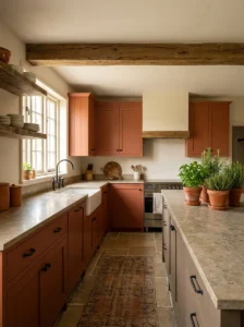
Terracotta and rust-toned cabinets bring genuine warmth into a kitchen in a way that feels earthy and grounded rather than trendy, and I first saw this done successfully in a friend’s farmhouse-style kitchen, where the warm, clay-like color played beautifully against her existing wood beams and natural stone countertops.
I’d describe this color as one of the more personality-forward choices on this entire list, definitely not a safe, neutral option, so it’s worth genuinely loving the color rather than just liking it in a photo before committing an entire kitchen’s worth of cabinetry to something this specific and bold.
Pairing terracotta with black hardware rather than brass or chrome tends to ground the warmth of the color rather than amplifying it further, creating a nice visual balance that keeps the overall look from feeling overly saturated or one-note across the whole kitchen space.
This color pairs beautifully with green as an accent, whether through a tile backsplash, potted herbs on an open shelf, or simply a few plants scattered around the kitchen, since the warm rust and cooler green sit naturally opposite each other and create a genuinely pleasing, earthy contrast throughout the room.
7. Soft Blush Pink
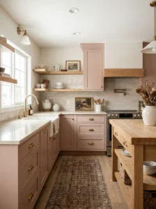
A soft, muted blush pink might sound like an unusual choice for kitchen cabinets, but I’ve seen it done with genuine sophistication in a friend’s small galley kitchen, where the soft color made the narrow space feel warm and inviting rather than cold or clinical the way an all-white kitchen sometimes can.
The key here is choosing a dusty, grayed-down blush rather than anything bright or overtly “pink” in the traditional sense, since the muted undertone reads as sophisticated and neutral-adjacent rather than overly feminine or trendy in a way that might feel limiting to future buyers if resale matters to you.
I’d pair this color with brass hardware and warm wood accents rather than anything cool-toned or stark white, since the combination creates a cohesive, warm palette throughout the kitchen rather than one bold color fighting against an otherwise cold, contrasting backdrop of fixtures and surfaces.
This shade works particularly well in kitchens that get plenty of natural light, since blush pink can occasionally read a bit flat or dull in darker spaces without enough sun exposure to bring out its warmth. Test a sample at different times of day before committing to the full cabinet run.
8. Charcoal Gray
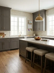
Charcoal gray sits in a genuinely versatile middle ground between the drama of full black and the softness of a lighter neutral, and it’s the color I ultimately chose for my own kitchen renovation after months of going back and forth between something bolder and something safer.
I found that charcoal gray hides everyday wear remarkably well, much like navy does, while still feeling considerably lighter and less intense than true black cabinets would in the same space, which made it feel like a genuinely safer long-term commitment for a family kitchen with kids running through daily.
This color pairs beautifully with almost any hardware finish, honestly, which is part of why I ultimately chose it. I’ve seen it done gorgeously with brass, matte black, and even polished chrome, giving you genuine flexibility to change your hardware down the road without needing to repaint the entire kitchen.
I’d recommend a warmer, slightly brown-toned charcoal over a true cool gray if your kitchen already has warm wood floors or countertops, since the warmer undertone bridges the two elements together more cohesively than a stark, cool-toned gray would against warmer existing materials.
9. Butter Yellow
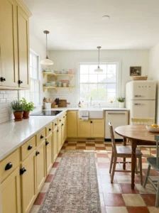
Butter yellow cabinets bring a genuinely cheerful, sunny energy into a kitchen, and I first saw this done successfully in a friend’s vintage-inspired kitchen renovation, where the soft yellow paired with white subway tile and simple black hardware for a look that felt both nostalgic and completely current at the same time.
I’d recommend a muted, buttery yellow rather than anything bright or overly saturated, since the softer tone feels considerably more livable day-to-day and avoids the slightly dated, overly sunny feeling that brighter yellows from decades past sometimes carry with them into a modern renovation.
This color works particularly well in kitchens that don’t get a ton of natural light, since yellow has a way of making a space feel brighter and warmer than it might otherwise appear, essentially doing some of the visual work that additional windows or skylights would otherwise need to accomplish.
Pairing butter yellow with black and white accents throughout the rest of the kitchen — a checkerboard floor, black hardware, white countertops — creates a classic, almost diner-inspired look that feels playful without tipping into something that reads as overly theme-y or costume-like in daily use.
10. Deep Forest Green
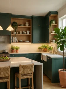
Deep forest green has become one of my personal favorite kitchen cabinet colors after helping a close friend paint her entire kitchen this shade last year, watching the transformation happen in real time from a dated, builder-grade oak finish into something that genuinely looked like it belonged in a design magazine.
The richness of a true forest green reads as both sophisticated and warm at the same time, striking a nice balance between the drama of navy or black and the softness of something like sage, making it a genuinely versatile choice for kitchens that want personality without going fully bold and dramatic.
I’d pair this color with brass or gold hardware specifically, since the warm metal tone complements the depth of the green beautifully, creating a rich, almost jewel-toned look throughout the kitchen that photographs and lives beautifully under both natural and warm artificial lighting.
This shade works particularly well alongside natural wood elements, whether that’s open shelving, a butcher block countertop, or simply wood floors extending from an adjoining room, since the combination of deep green and warm wood tones creates a genuinely organic, grounded feeling throughout the whole space.
11. Matte Black Hardware Pairing
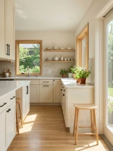
While not a cabinet color itself, pairing whatever color you choose with matte black hardware has become one of the most impactful, lowest-cost updates I consistently recommend to friends, since swapping hardware alone can dramatically change the entire feel of a kitchen without touching the cabinet paint at all.
I swapped my own brass hardware for simple matte black pulls a few years back, and the change alone made my white cabinets feel considerably more modern and grounded, proving that hardware really does function as the “jewelry” of a kitchen in a way that’s easy to underestimate until you see it firsthand.
This pairing works particularly well with lighter cabinet colors specifically — white, cream, sage, blush — since the black hardware provides genuine contrast and definition that can otherwise get lost against a busier or already-dark cabinet color where the hardware might blend in rather than stand out.
I’d recommend measuring your existing hardware holes carefully before ordering new pulls, since matching the existing spacing (called the “center to center” measurement) saves you from drilling new holes entirely, which was a detail I completely overlooked the first time and ended up regretting.
12. Colorful Island Only
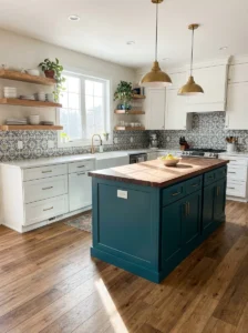
Painting just the kitchen island a bold, contrasting color while leaving the rest of the cabinetry in a neutral shade is a fantastic way to introduce real personality into a kitchen without committing to a bold color across every single cabinet, and it’s the approach I ultimately took in my own most recent kitchen update.
I chose a deep teal for my island specifically, while keeping the surrounding perimeter cabinets in a simple white, which let the island genuinely function as a statement piece and a natural focal point the moment you walk into the room, without overwhelming the entire space in one dominant color.
This is also one of the more budget-conscious options on this list, since you’re only painting a single piece of furniture rather than an entire kitchen’s worth of cabinetry, making it considerably more approachable for anyone testing out a bold color choice for the first time before fully committing.
I’d recommend choosing an island color that echoes something else already present in the kitchen — a tile backsplash, a piece of art, even a runner rug — so the contrasting color feels intentional and connected to the rest of the space rather than randomly plopped in without any real relationship to its surroundings.
13. Creamy Off-White/Greige
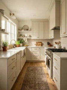
A soft, creamy greige — that in-between shade blending gray and beige — has become my go-to recommendation for anyone wanting a neutral update that feels considerably warmer and more current than a stark, cool-toned white, which can sometimes feel a little clinical or sterile in an everyday family kitchen.
I painted my own kitchen this exact shade a few years back after growing tired of a colder white that never quite felt cozy, and the warmer undertone made an enormous difference in how inviting the whole room felt, especially paired with warm wood floors and brass hardware throughout.
This color is genuinely one of the safest, most universally appealing choices on this entire list, which makes it a smart option if resale value matters to you or if you’re simply someone who prefers a calmer, more neutral backdrop that won’t feel dated or trend-driven several years down the road.
I’d recommend testing greige samples at different times of day before committing, since this particular color family can shift noticeably between looking more gray or more beige depending on your kitchen’s specific lighting, which caught me off guard the first time I painted a sample swatch on my own wall.
14. Olive Green
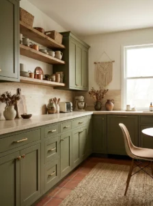
Olive green sits in a genuinely different color family than sage or forest green, leaning more toward a muted, earthy yellow-green rather than a cooler, bluer green, and it’s a shade I’ve grown to love after a friend used it throughout her kitchen renovation last year to beautiful, understated effect.
The muddier, more complex undertone in olive makes it read as considerably more sophisticated and vintage-inspired compared to a brighter, more straightforward green, which suited my friend’s older home with original architectural details far better than a crisper, more modern green tone would have.
I’d pair this color with warm brass hardware and natural wood accents rather than anything cool-toned or stark, since olive’s earthy warmth plays beautifully off similarly warm materials throughout the kitchen, creating a cohesive, grounded palette rather than one element feeling disconnected from the rest.
This shade works particularly well in kitchens aiming for a slightly retro, 1970s-inspired aesthic without leaning into full costume-like nostalgia, since olive carries just enough of that vintage association to feel intentional and stylish rather than accidentally dated or stuck in a specific decade.
15. Two-Tone with Wood Accents
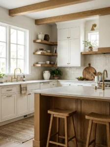
Combining painted cabinets with sections of natural, unpainted wood has become one of my favorite ways to add warmth and texture into an otherwise fully painted kitchen, and I did exactly this in my own space by leaving a run of open wood shelving unpainted against otherwise white cabinetry.
The contrast between the crisp painted surfaces and the raw, natural wood grain creates genuine visual interest and texture that a fully painted kitchen, however well-executed, can sometimes lack on its own, especially in a smaller kitchen where every surface tends to draw the eye more directly.
I’d recommend choosing which specific elements stay wood carefully rather than randomly, since open shelving, a kitchen island, or a single accent wall of cabinetry tend to work better as the “wood moment” than scattering small unpainted touches throughout the space without any clear intention or pattern.
This approach also solves a very practical problem for anyone hesitant to fully commit to painting every single cabinet in their kitchen, letting you ease into the process by starting with just a portion of the space while leaving room to paint additional sections later if you decide you love the direction.
16. Dusty Blue
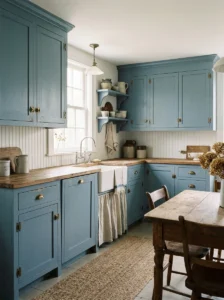
Dusty blue occupies a lovely middle ground between the drama of deep navy and the softness of a pale pastel, and it’s the color a close friend chose for her cottage-style kitchen renovation, where the muted, slightly grayed-down blue paired beautifully with her white beadboard backsplash and worn wood countertops.
I’d describe this shade as genuinely calming in a way that’s hard to overstate until you’re actually standing in a kitchen painted this color, since the softness of dusty blue avoids feeling cold or sterile the way a brighter, more saturated blue sometimes can in an everyday living space.
This color pairs particularly well with brass or aged bronze hardware rather than anything sleek or modern, since the slightly worn, vintage-feeling metal finishes complement the softness of the blue far better than something shiny and contemporary would against this specific, more relaxed color palette.
I’d recommend this shade for anyone drawn to a coastal or cottage aesthetic specifically, since dusty blue carries genuine associations with that relaxed, seaside style without needing to lean into anything overly literal or theme-like, such as actual nautical decor or beach-themed accessories throughout the kitchen.
17. Chalky Finish Vintage Look
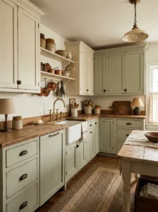
Using a chalk-style paint finish, rather than a standard satin or semi-gloss cabinet paint, creates a genuinely matte, slightly textured look that reads as intentionally vintage and aged, which is exactly the effect a friend was going for when she repainted her farmhouse kitchen’s original, decades-old cabinetry.
I’d caution that chalk paint, while beautiful, isn’t always the most durable option for high-touch surfaces like cabinet doors and drawer fronts, so a proper protective topcoat (usually a wax or a specific sealant made for this purpose) becomes essential rather than optional if you go this particular route.
This finish works beautifully paired with distressed or lightly sanded edges, giving cabinets a genuinely worn-in, collected-over-time look that a crisp, perfectly smooth modern paint job simply can’t replicate, no matter how careful or precise the application itself might be during the painting process.
I’d recommend this approach specifically for older homes with genuine architectural character already present, since the vintage, slightly imperfect finish tends to feel more intentional and cohesive in a home that already has some age and history to it, rather than in a newer, more modern build.
18. Contrasting Interior Cabinet Color
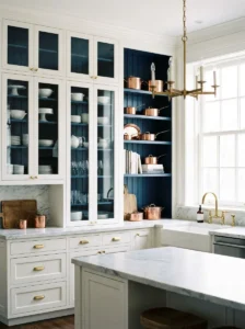
Painting just the interior of open cabinets or glass-front cabinet doors a contrasting color is a small, often overlooked detail that makes an enormous visual difference, and I did exactly this in my own kitchen, painting the interior of my open shelving a deep navy against otherwise white exterior cabinetry.
This trick works particularly well for open shelving or glass-front cabinets specifically, since a closed, solid cabinet door hides the interior entirely, meaning you’d be putting in the extra painting effort for a detail nobody would actually ever see once the doors are shut in daily use.
I’d recommend choosing a bold, contrasting color for this specific detail rather than something subtle, since the whole appeal here is the surprise and visual pop that comes from opening a cabinet or glancing into open shelving and seeing an unexpected color peeking out from behind your dishware.
This is also one of the lowest-cost updates on this entire list, since you’re only painting a small, contained area rather than full cabinet doors or drawer fronts, making it an easy weekend project to test out a bold color commitment before deciding whether to expand it further throughout the kitchen.
19. Muted Mauve
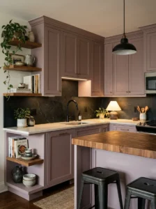
Muted mauve, that dusty, grayed-down pink-purple shade, has become an increasingly popular choice for kitchens wanting something a bit more unexpected than the now-common sage or navy, and I first saw it done beautifully in a friend’s small city apartment kitchen renovation last year.
The key to making mauve feel sophisticated rather than overly sweet or feminine is choosing a genuinely muted, complex version of the color rather than anything bright or overtly pink, since the grayed-down undertone reads as moody and elegant rather than playful or overly soft in a kitchen setting.
I’d pair this color with black or aged brass hardware rather than anything bright or polished, since the more muted metal finishes ground the softness of the mauve and prevent the overall look from feeling too delicate or precious for a space that needs to handle daily cooking and cleanup.
This shade works particularly well in smaller kitchens or apartments specifically, since the softness and slight warmth of mauve tends to feel cozy and enveloping in a compact space, rather than the slightly stark feeling a very light or very dark color can sometimes create in tighter square footage.
20. High-Gloss Finish
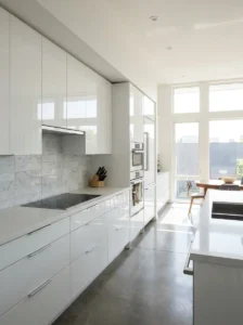
Choosing a high-gloss finish rather than the more common matte or satin sheen creates a genuinely different, considerably more modern look, and I saw this done beautifully in a friend’s sleek, contemporary kitchen renovation, where a high-gloss white finish made the entire space feel bright, reflective, and almost showroom-polished.
I’d caution that high-gloss finishes show every imperfection in the underlying cabinet surface far more dramatically than a matte finish would, meaning any dents, scratches, or uneven spots in the original wood need to be properly sanded and filled before painting, or they’ll be glaringly obvious once the glossy topcoat goes on.
This finish also tends to show fingerprints and smudges considerably more than a matte or satin sheen, so I’d genuinely think through your household’s daily habits before committing, since a family with young kids constantly touching cabinet fronts might find themselves wiping down surfaces far more often than they’d like.
Despite the extra maintenance, high-gloss cabinets create a genuinely striking, light-reflecting effect that can make a kitchen feel considerably brighter and more spacious, especially in darker colors like navy or black, where the glossy finish helps prevent the deep color from feeling too heavy or flat in the space.
21. Ombre / Gradient Cabinets
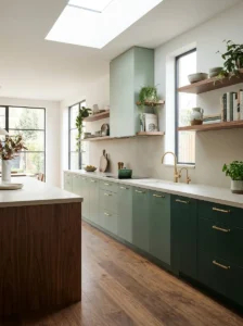
An ombre or gradient effect across kitchen cabinets, where the color gradually shifts from light to dark (or one hue to another) across a run of cabinetry, is genuinely one of the boldest, most artistic choices on this entire list, and I’ve only seen it attempted successfully a handful of times.
A friend who’s a professional painter did this in her own kitchen, blending from a soft sage at one end of her cabinet run to a deeper forest green at the other, with several carefully blended shades in between, creating a genuinely striking, almost painterly effect that guests notice immediately upon walking in.
I’d strongly recommend hiring a professional for this specific technique rather than attempting it as a DIY project, since achieving a smooth, believable gradient across multiple cabinet doors requires real skill with paint blending that’s considerably harder to execute well than a single, solid color application would be.
This is a genuinely high-commitment, statement-making choice that won’t suit every home or every homeowner’s taste, but for anyone wanting something truly unique and artistic in their kitchen, rather than following a more established, common color trend, an ombre effect delivers a look that’s almost impossible to replicate through any other method on this list.
Whichever direction you choose, remember that cabinet paint is one of the more reversible major updates you can make to a kitchen — if you fall out of love with a bold color a few years down the road, it can always be repainted again. That knowledge alone is what gave me the confidence to finally commit to color in my own kitchen, and it’s advice I pass along to every friend who’s hesitating before picking up a paintbrush.